Renascent Reimagined: A Website Built with Intent
Renascent, a national construction company known for premium fitouts and refurbishments across Australia, needed a digital refresh. Their old site was informative but visually outdated, failing to match the quality or confidence of their brand. It felt flat and cluttered, lacking the presence of a business at the top of its field.
They came to us with a clear goal: design a modern, confident website that aligned with their reputation and let the work speak for itself.
The Approach
We didn’t treat this as a surface-level update. From layout to typography, colour to spacing, every element was reconsidered. It was a clean break, built on visual impact, ease of use, and brand alignment.
Working closely with the Renascent team, our web design team provided direction that matched their strengths: refined, understated, and built with intent. The final result needed to feel as precise as their construction work and just as enduring.
The Execution
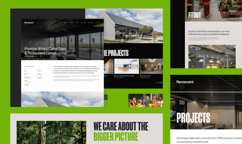
A Clean Break from the Past
The original Renascent website had the hallmarks of many legacy corporate sites: heavy on structure, light on inspiration. While it served its purpose from a functionality standpoint, the design had become flat, dated, and overly reliant on rigid templates. We approached the redesign not as a refresh but as a reset—one that would redefine the brand’s visual tone and UX principles from the ground up.
We began by auditing every element: layout structure, menu architecture, content modules, and design components. What followed was a deliberate teardown. The goal wasn’t just to modernise, but to create a platform that felt confident, uncluttered, and distinctly Renascent. Every visual choice—typography, spacing, palette, interface hierarchy—was made to support clarity, accessibility, and a sense of polish.
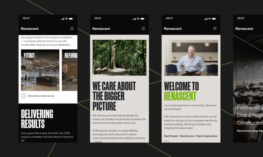
Typography that Holds Weight
Typography was one of the most influential tools in reshaping the site’s visual tone. We knew the type needed to communicate trust and capability without being loud or ornamental. The final type system achieves a thoughtful balance: strong, well-proportioned headings anchor the layout without stealing focus, while clean, light body copy ensures content is easy to read across screen sizes.
Consistency in type scale, line height, and letter spacing brings a strong sense of rhythm to the user experience. Rather than relying on overly complex styling, we let the typography guide the user’s attention naturally—introducing hierarchy, flow, and calm throughout the site.
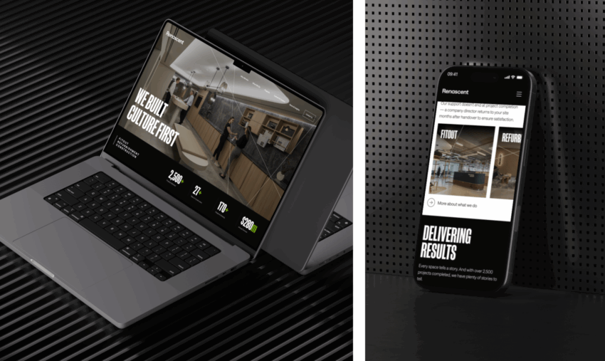
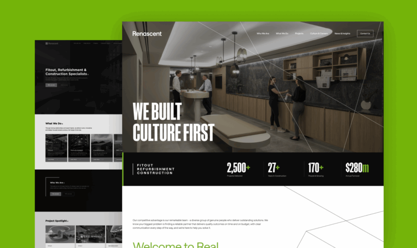
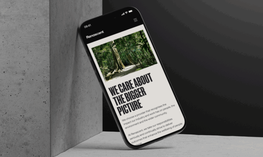
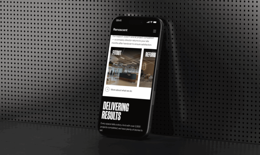
A Dark, Confident Palette
We moved away from the conventional light themes commonly seen in construction and corporate sites. Instead, we introduced a dark, tonal base—anchored by charcoal and accented by crisp white text and cool greys. This wasn’t about being trendy; it was about tone. The darker theme immediately conveys professionalism, maturity, and control.
It also brings clarity to the foreground. White text on a deep background enhances legibility and visual sharpness, while minimal use of colour prevents distraction. By stripping back the palette to its essentials, we let the photography and layout speak with more authority—without ever shouting.
Layout with Breathing Room
Good design isn’t just about what’s on the page—it’s about the space around it. One of the most noticeable shifts in the redesign was the introduction of generous padding, deliberate white space, and a consistent grid system. The original site felt dense and compressed, while the new layout breathes.
Each section was intentionally spaced to create moments of pause between content. Whether browsing a homepage hero or scrolling through project case studies, users now experience the site at a more comfortable, deliberate pace. This sense of spaciousness improves readability, lowers cognitive load, and visually reinforces the confidence of the brand.
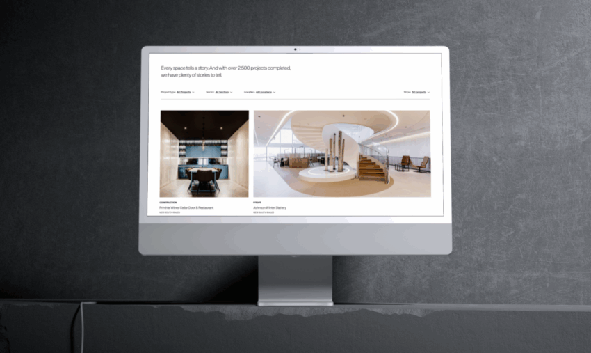
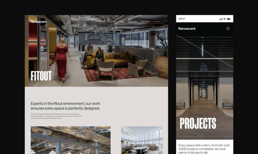
Letting the Work Speak
Renascent’s project work is its best sales tool—so we stepped aside and let it take the lead. We designed a layout that puts imagery front and centre, with minimal text and no visual noise to compete with the photography. Project pages feature full-width visuals and consistent formatting that allows users to focus on the architectural and construction details that matter.
Instead of relying on decorative flourishes or animated gimmicks, we embraced restraint. The interface is quietly confident, placing the spotlight on completed builds while maintaining an elegant frame around them. The result is a portfolio experience that feels immersive and refined, not cluttered or over-explained.
A Practical, Purposeful Design
While aesthetics were central to the brief, we never lost sight of function. Every design decision had a purpose: improving navigation, reducing bounce rates, and supporting mobile users without compromise. We kept the codebase lean, ensured responsiveness across all devices, and built the CMS around usability, so Renascent’s internal team can manage and update content with ease.
The final site loads fast, performs consistently, and maintains a lightweight structure behind its polished interface. In the end, this wasn’t about designing for design’s sake—it was about creating a digital presence that works as well as it looks.
Built on Webflow, Designed for Control
The new Renascent website was developed on Webflow to give their team complete control without sacrificing performance or polish. The platform allowed us to translate the custom design into a fast, responsive build, while giving Renascent a visual editor they could use. From updating project content to adjusting layouts, the CMS is intuitive, making future changes scalable and straightforward. Webflow also enabled us to fine-tune the site’s interactions and responsiveness precisely, ensuring a seamless experience across every device.
The Outcome: A Website that Reflects the Brand
The redesigned Renascent website feels aligned with who they are—polished, capable, and confident. It gives visitors an immediate sense of quality and trust, while providing the internal team with a flexible, easy-to-manage platform.
The new site doesn’t just look better, it positions Renascent for growth, elevates their brand online, and reflects the professionalism they bring to every build.
Looking to elevate your digital presence with a design-first approach?
At Click Click Media, we don’t just design websites—we create digital experiences that elevate your business. If your current site no longer represents the quality of your work, we’re ready to help. Let’s build something better, together.
Get in touch to start your transformation.