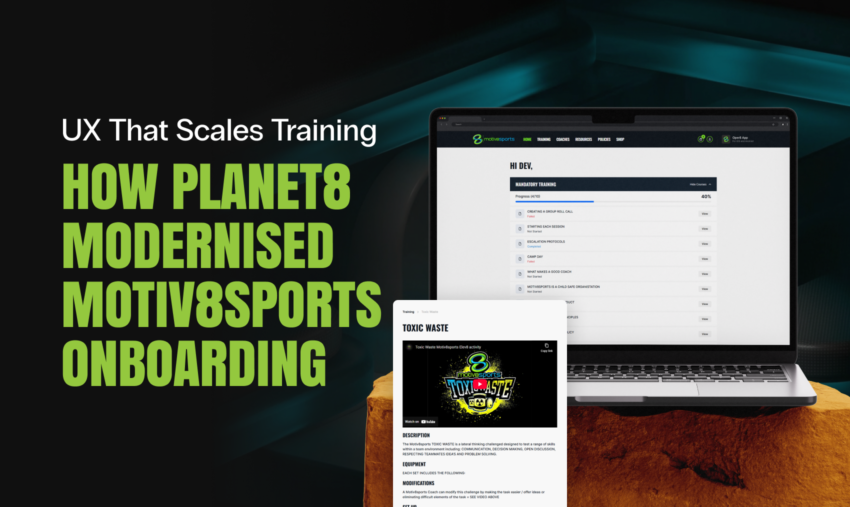
UX That Scales Training: How Planet8 Modernised Motiv8sports Onboarding
Motiv8sports has spent more than 16 years building a sports entertainment and education business that helps kids fall in love with sport through confidence, teamwork, sportsmanship, and leadership. Founded in 2001, the brand has grown through an energetic, people-first culture powered by franchisees, coaches and support staff.
That culture is exactly why internal training matters. When the experience on the field is high-energy and consistent, it is rarely “just talent”, it is process, standards, and onboarding done properly behind the scenes.
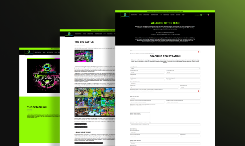
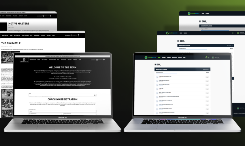
Planet8 is Motiv8sports’ internal staff training portal. It’s where coaches and franchisees learn how to run camps and activities, complete required onboarding steps, and access operational resources and policies. The original version existed, but it had become clunky, visually overwhelming, and genuinely difficult to use at scale.
This project was a full rethink, from design thinking through to UI design and development, with a clear goal: make training fast to navigate, easy to track, and simple to administer.
The Starting Point: When “Content” Becomes a UX Problem
The legacy Planet8 experience had a few issues that compounded into one big operational drag:
- The interface felt dated and visually heavy, including a lot of intense green that made the experience feel overwhelming.
- Navigation and information architecture had grown organically, with categories scattered across the header in a way that felt random rather than intentional.
- Training content was largely presented like blog posts, which made “reading” easy but made “completing training” difficult.
- Progress tracking was poor. Coaches could not easily see what was done vs what was left, and franchisees lacked the visibility needed to support staff properly.
- There was no clean way to distinguish mandatory training from optional learning.
- Key compliance steps were fragmented, including policy acceptance and agreement sign-offs.
- The login experience itself was confusing, surfacing the coach registration screen in a way that did not match user intent.
From a design perspective, this is a common failure mode for internal portals: the platform grows around content publishing, not around user workflows. The result is a system that technically contains everything, but fails the moment someone needs to move quickly, verify completion, or manage multiple staff at once.
Design Thinking: Reframing Planet8 Around Jobs To Be Done
Rather than treating this as a “reskin”, we treated Planet8 as a workflow product with three primary jobs:
- Coach: “Tell me exactly what I need to do, let me do it quickly, and show me my progress clearly.”
- Franchisee: “Show me how my team is tracking, where they are stuck, and what needs chasing.”
- Admin: “Give me full oversight, clean data, and simple tools to manage training, content, and compliance.”
That framing drove every design and build decision afterwards, particularly around role-based access, dashboarding, and the separation of training vs resources vs policies.
UI Overhaul: Cleaner, Modern, and Built for Momentum
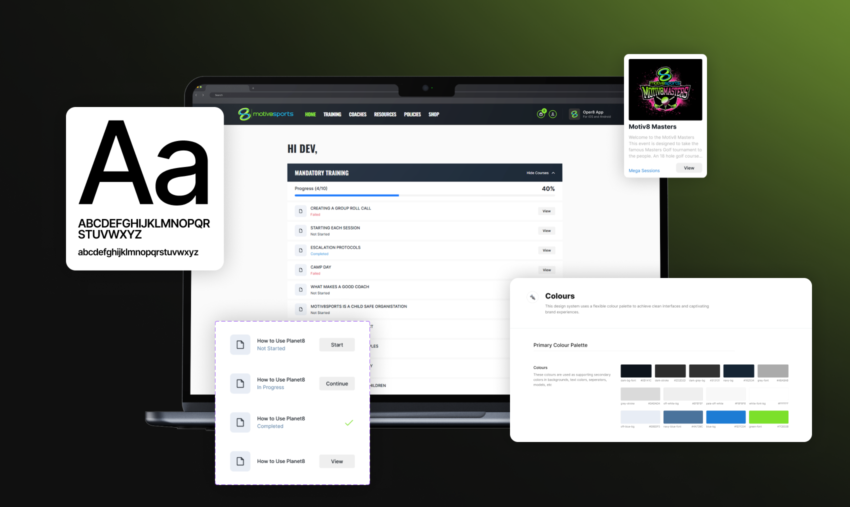
The new interface was designed to feel current and calm, aligning with modern UI expectations:
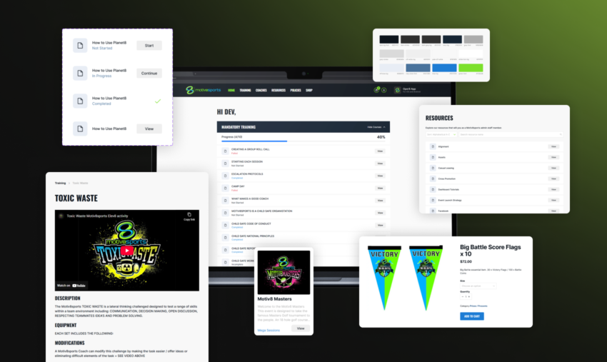
- A cleaner colour system with better restraint and contrast
- Typography that improves scanning, hierarchy and readability
- Layout spacing that reduces cognitive load, especially when users are tired or rushing between sessions
- Components and page templates designed for repeatability, so the platform stays consistent as it grows
We effectively introduced a tighter internal design guideline for Planet8 so new sections could be added without breaking the look and feel.
Information Architecture: From Random Links to a Single Training Source of Truth
One of the biggest UX wins was centralising training into a single destination.
Previously, training categories lived across the header as separate items. This creates two problems:
- Users must remember where content “lives”.
- New categories create more navigation clutter, which makes the platform feel harder over time.
We introduced a dedicated Training page that acts as the one place to find and complete learning, regardless of category. On that page, users can:
- Filter by training category
- Search directly across training content
- Immediately understand what is available and what is required
This is a small structural decision with a large usability impact. It turns discovery into a predictable pattern, which is exactly what internal tools should do.
Role-Based Experiences: Three Views, Three Realities
Planet8 now supports three user types with purpose-built experiences:
Coach view
- Focused purely on completing onboarding and training
- Clear progress visibility
- Simple access to resources and policies without mixing them into courses
Franchisee view
- Visibility over staff under their franchise
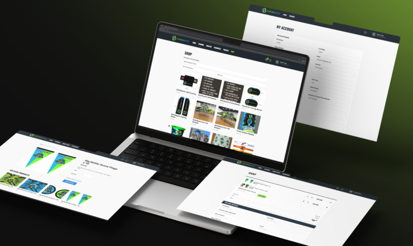
- Access to training, coach info, resources, policies, and the shop
- A practical operational hub, not just a learning library
Admin view
- Full oversight across all franchisees and coaches
- Control over training content, quizzes, resources, policies, and users
- Cleaner administration workflows that reduce manual effort and errors
This separation is where internal portals typically either succeed or fail. When every user sees the same interface, you get compromises everywhere. By designing for distinct roles, Planet8 becomes faster for everyone.
Progress Tracking: Turning Training Into a Measurable System
The legacy portal made it difficult to answer a basic question: “How far through am I?”
We built a dedicated home dashboard that gives users an immediate view of progress, including:
- Percentage completion of mandatory training
- Course statuses: Incomplete, In Progress, Complete
- Visibility into optional categories, so learning does not stop at compliance
This is a design move as much as it is a functional one. It gives users a sense of momentum and reduces uncertainty, both of which increase completion rates in any training environment.
For franchisees and admins, this progress data becomes operationally valuable because it enables real follow-up. Instead of guessing, they can see exactly what is incomplete.
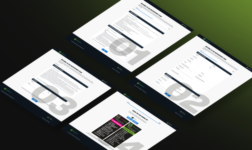
Fixing the Biggest UX Pain Point: Onboarding as One Guided Flow
The old onboarding process was fragmented and admin-heavy:
- Users filled out a form and then waited
- Admin manually accepted the user
- Separate agreements were sent and checked separately (IP, employment terms, confidentiality)
- Only after all that did the user receive login details
This is the kind of process that quietly drains hours every week.
We rebuilt onboarding as a single guided process that includes:
- User details
- Financial details
- All agreements and digital sign-off, including IP undertaking
The experience is now cohesive and logical. Even more importantly, it is automated, so coaches can complete onboarding and then log in immediately via an email link, removing unnecessary manual admin steps.
Motiv8sports also uses a broader “Nexus” setup to manage access across their ecosystem (including the main site and Oper8 app). Planet8 onboarding was designed to fit into that reality, with integration work completed in collaboration with Paladine Systems, who supported the Nexus functionality.
Training Content That Actually Trains: Videos, Quizzes, and Structure
Planet8 upgrades included adding real training mechanics, not just content pages:
- Online training videos
- Quizzes attached to courses
- Clear separation between mandatory and optional learning
This shifted Planet8 from “read these posts” to “complete this pathway”, which is a critical difference in staff enablement.
Data and Oversight: Coach Profiles, Completion Visibility, Policy Acceptance, eCommerce
On the old system, it was difficult to view coach data and progression in a meaningful way.
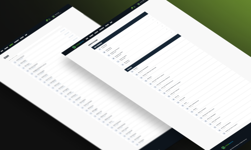
The new build introduced:
- The ability to view coach data and training progression
- Clear separation of training vs policies vs resources
- A better way to track policy acceptance and agreement completion, reducing compliance ambiguity
This is the kind of functionality that matters most as the organisation grows, because it helps maintain consistency across franchises and locations.
Planet8 includes a shop and checkout experience for merchandise purchasing. We refined the visuals and flow to make the experience smoother and more modern, consistent with the rest of the portal.
Build Approach: WordPress, Re-Engineered for a Cleaner Backend
Planet8 remained on WordPress, but the difference is how it is structured.
Instead of forcing everything into posts and pages, we created distinct management areas so the system is maintainable:
- Training courses
- Quizzes per course
- Resources
- Policies
- Users
This improves consistency for staff maintaining the portal and reduces the risk of content being added in the wrong place or format.
Outcomes: A Portal That Supports the Business, Not Just the Content
The practical outcomes of Planet8 were clear:
- Staff can find training quickly through one centralised training hub
- Coaches can see exactly what they must do and what they have completed
- Franchisees can support teams with real visibility, not guesswork
- Admin workload is reduced through onboarding automation and cleaner structures
- Compliance steps are consolidated and trackable
- The design now feels modern, clean, and aligned with current UI expectations
Motiv8sports reported they were very happy with the result, and that it made the staff training process substantially easier to run.
What This Project Really Was: A Shift From “Portal” to “Product”
Planet8 is a strong example of how internal platforms need product thinking:
- UX is not decoration, it is operational efficiency
- Information architecture is not navigation, it is speed and clarity
- Role-based design is not complexity, it is relevance
- Progress visibility is not a feature, it is motivation and accountability
For Motiv8sports, the new Planet8 platform means coaches spend less time searching and more time preparing, franchisees can manage staff training with confidence, and the entire organisation benefits from a scalable training foundation that matches the energy of the brand.
Ready to Turn Your Internal Portal Into a Product?
If your training portal, intranet, or internal tool has become hard to navigate, impossible to track, or admin-heavy, we can help.
Click Click Media designs and develops role-based platforms that make onboarding simpler, training measurable, and day-to-day workflows faster, without losing sight of brand and usability.
Speak to our team about a portal redesign or custom build, and we’ll map the UX issues, propose a cleaner structure, and deliver a modern platform your staff actually want to use.