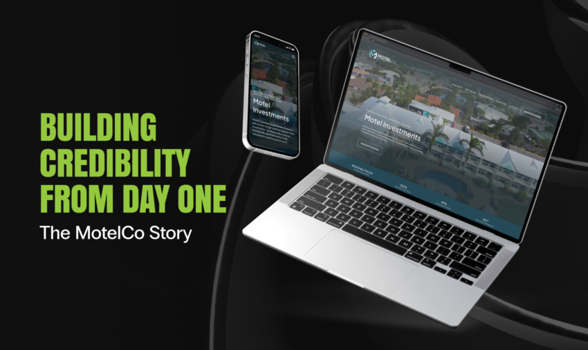
Building Credibility from Day One: The MotelCo Story
When a sophisticated investor lands on your website, they make a judgment call in seconds. Does this feel credible? Does this feel serious? Do these people know what they’re doing?
For MotelCo, a brand new syndicator and investment manager entering one of Australia’s most niche property sectors, those few seconds carried enormous weight. They had the team, the track record, and the thesis. What they needed was a digital presence that communicated all of it, instantly and compellingly.
They came to Click Click Media. Two weeks later, they had it.
Who Is MotelCo?
MotelCo is a specialist syndicator and investment manager focused exclusively on the Australian regional motel sector. They source high-yielding assets, syndicate them among sophisticated investors, and actively manage every property to maximise returns. Behind the business are two executives with decades of institutional property and funds management experience.
A Brief with No Room for Mediocrity
When MotelCo approached us, they were preparing to go to market and needed to move fast. But speed couldn’t come at the cost of quality. Their target audience, sophisticated investors and regional motel owners, would see through anything that felt rushed, templated, or generic. These aren’t impulse buyers. They’re experienced, discerning people who make decisions worth hundreds of thousands of dollars, and they know the difference between a brand that has been thought through and one that hasn’t.
Their goals were clear:
- Build brand awareness in a niche sector where they had zero existing profile
- Educate and inform a discerning audience about a nuanced investment model
- Capture enquiries from two distinct audiences: investors seeking high-yield opportunities, and motel owners open to divestment or management partnerships
- Get live quickly to support business development conversations already underway
The deliverables: a fully custom designed and developed landing page, and a companion pitch deck for face-to-face investor meetings.
The timeline: two weeks.
Challenge accepted.
The Design Problem We Had to Solve
Here’s what makes a brief like this genuinely interesting: regional motel investment is not an easy thing to communicate.
It sits in an unusual space. It’s not traditional commercial property. It’s a hybrid of real estate security and active business cash flow. It targets assets that are overlooked by big capital, yet demands institutional-grade governance and compliance. Most investors have never seriously considered it as an asset class, which means the design had to do two jobs at once: build the credibility of the business and build the credibility of the sector simultaneously.
That’s a harder brief than it sounds. The design couldn’t just look good. It had to work hard: breaking down complexity, building trust, and making a compelling case, all while holding the attention of an audience whose time is genuinely valuable and whose patience for vague or unclear communication is limited.
The visual tone had to thread a needle too. Professional enough to command respect, warm enough to feel human, and grounded enough to feel honest. One degree too corporate and it becomes cold and impenetrable. One degree too casual and it undermines the weight of a licensed investment offering. Getting that balance right wasn’t a happy accident. It was the result of deliberate, considered creative decisions made at every stage of the project.
That tension is exactly where great design lives.
What We Built
A Visual Identity Built on Earned Trust
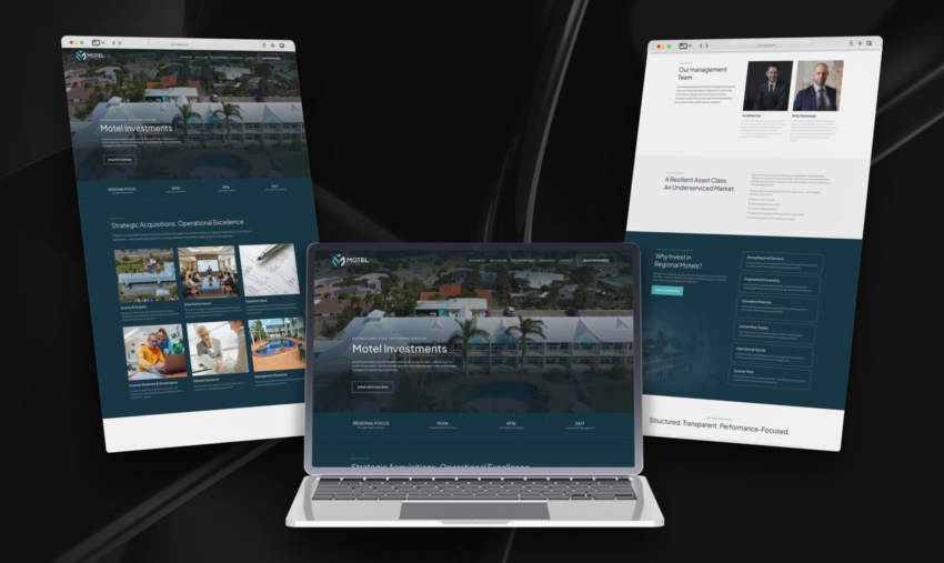
The first decision, and in many ways the most important, was colour. We anchored MotelCo’s palette in deep teal and navy, punctuated by crisp whites and soft neutrals. It’s a palette that references regional Australia and open water, signals financial stability, and creates the kind of confident, composed first impression that makes a sophisticated investor sit up a little straighter.
Typography is set throughout in Plus Jakarta Sans, a choice that reflects exactly the balance MotelCo needed. It has the geometric confidence of a modern financial brand, but enough warmth and character to prevent the page from ever feeling like a bank brochure. Bold, decisive headings draw the eye and anchor each section. Clean, readable body text invites visitors to slow down and absorb the detail. Every size and weight was chosen deliberately, because in a brand that’s starting from zero, typography does more heavy lifting than most people realise.
Together, the palette and typography establish a brand that feels established, even for a business that’s brand new. That’s not a trick. It’s the result of making every design decision with clear intent. If you’re curious about how we approach brand-led custom web design, this project is a strong example of that process in action.
A Page That Tells a Story
The landing page is a single, long-form scroll experience, the right format for a high-intent audience that needs to be walked through a proposition step by step. But long-form only works if the narrative arc is airtight. This is central to how we think about UX design: every section should earn its place and move the visitor one step closer to taking action.
We structured the page to take a visitor on a journey:
Open with clarity. The hero section answers the most important question, what is this?, immediately. A looping video of a motel property plays behind the headline, slightly blurred to add depth without distraction. Below the primary CTA, four proof points are laid out in a clean stat bar: Regional Focus, 100% Specialist Sector Focus, AFSL Licensed & Compliant, 24/7 Active Asset Management. In ten seconds, a visitor knows what MotelCo does, that it’s regulated, and that it’s always on.
Build understanding. The “What We Do” section breaks the MotelCo model into six service pillars: Source & Acquire, Drive Performance, Maximise Value, Investor Relations & Governance, Tailored Solutions, and Management Expertise. Each is paired with a purposeful image. Blueprints and planning documents for acquisition. A business meeting for governance. A hotel room for management expertise. The photography doesn’t decorate the copy; it extends it.
Establish the people. The management team section puts faces and names front and centre, because investment decisions are ultimately made on trust in people. Jonathan and Kirby’s profiles are concise but credential-heavy, presented in a clean two-up portrait layout that feels personal without being informal. The combined weight of their experience is impossible to miss.
Make the case. Two sections work in tandem to build the investment thesis. “A Resilient Asset Class. An Underserviced Market.” frames the motel sector’s structural advantages: fragmented ownership, counter-cyclical demand, limited new supply, strong income yields. The follow-on “Why Invest in Regional Motels?” section unpacks six specific advantages in an accordion layout that rewards both skimmers and deep readers. You can get the headline version in 30 seconds, or spend five minutes in the detail. The page works either way.
Demystify the process. The four-step investment model, Acquisition, Syndication, Management, Exit, is laid out with numbered icons in a clean horizontal flow. Simple. Logical. Managed. Investors don’t need a manual; they need confidence that a process exists and someone is running it well.
Convert. A prominent “Register Interest” CTA lives in the fixed navigation bar throughout the entire page. On mobile, it never disappears. There’s no moment in the user’s journey where they have to hunt for a way to take action. This is the kind of conversion-focused thinking that sits at the core of our landing page design work.
Mobile: Every Bit as Sharp
The mobile version of the page isn’t an afterthought. It’s a first-class experience in its own right. The stacked layout maintains the visual hierarchy of desktop: bold headings, clear section labels, and the accordion-style content that keeps long sections scannable without truncating the substance. The “Register Interest” button stays pinned in the navigation at all times, because a lead shouldn’t be lost just because someone’s reading on their phone. Our WordPress development process builds responsiveness in from the ground up, not bolted on at the end.
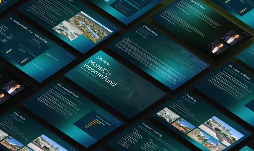
The Pitch Deck: Taking the Brand Into the Boardroom
Alongside the landing page, we designed a fully custom pitch deck for MotelCo, and it might be the deliverable that makes the most immediate commercial impact.
Here’s why: MotelCo is a syndication business. The moment that matters most isn’t when someone finds the website. It’s when Jonathan or Kirby sits down across from a potential investor and starts talking. That conversation needs to be supported by a document that matches the weight of the opportunity being presented.
The deck is a seamless extension of the landing page: same colour palette, same typeface, same visual language. When an investor moves from the website to the deck, or from the deck to the website, the experience is continuous and cohesive. There’s no version of MotelCo that looks different depending on where you encounter them, and that consistency signals exactly the kind of operational discipline investors want to see from a fund manager. It’s the same design thinking that drives our approach to custom web design: every touchpoint should feel like it belongs to the same brand.
Structurally, the deck walks an investor through everything they need to make a decision: the opportunity thesis, the team’s credentials, the investment model, the governance framework, and the return proposition. Each slide is designed to hold its own in a live presentation but read just as clearly as a leave-behind. It’s a deck that works in the room and after the room.
For a new business raising capital, a polished pitch deck isn’t a vanity item. It’s a trust signal. It says: we take this seriously, and we expect you to as well.
Two Weeks. One Cohesive Brand. Zero Shortcuts.
Let’s come back to the timeline for a moment, because two weeks for a fully custom designed and developed landing page, plus a complete pitch deck, is genuinely fast.
It’s possible because of how we work. Deep discovery at the start means no guessing later. A decisive creative direction means no going around in circles. A build process that prioritises quality means no redoing work that wasn’t right the first time.
The result for MotelCo: a brand-new business with a digital presence that punches well above its age. A landing page that builds awareness, educates investors, captures leads, and communicates credibility from the very first scroll. A pitch deck that walks confidently into boardrooms. And a visual identity strong enough to grow with the business as it scales.
The Takeaway
The best design work isn’t about making things look nice. It’s about making things work, for the audience, for the business, and for the moment the two meet.
MotelCo needed to establish credibility in a competitive, niche, high-stakes sector without the luxury of time or a long track record to lean on. The design had to carry weight that a brand-new business couldn’t yet carry on its own.
We’re proud of what we built together. And we’re looking forward to watching MotelCo grow into it.
Want to see what Click Click Media can do for your business? Explore our web design services, browse our design portfolio, or get in touch to start the conversation.