Click Click Media’s Logo Use Guide
This guide outlines the correct usage of the Click Click Media logo across all digital and print applications. Consistent logo use protects brand recognition and ensures clarity wherever the brand appears.
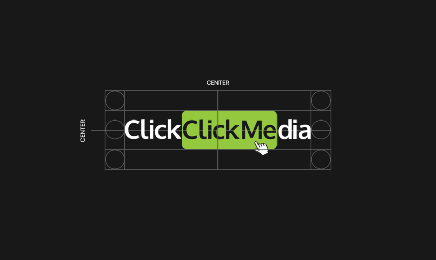
1. Primary Logo
The primary Click Click Media logo consists of the full wordmark with the green rounded rectangle highlighting the second “Click,” accompanied by the cursor icon.
This version should be used whenever possible and is the default choice for:
- Website headers and footers
- Marketing collateral
- Sales presentations
- Case studies and proposals
- Social media profiles and cover images
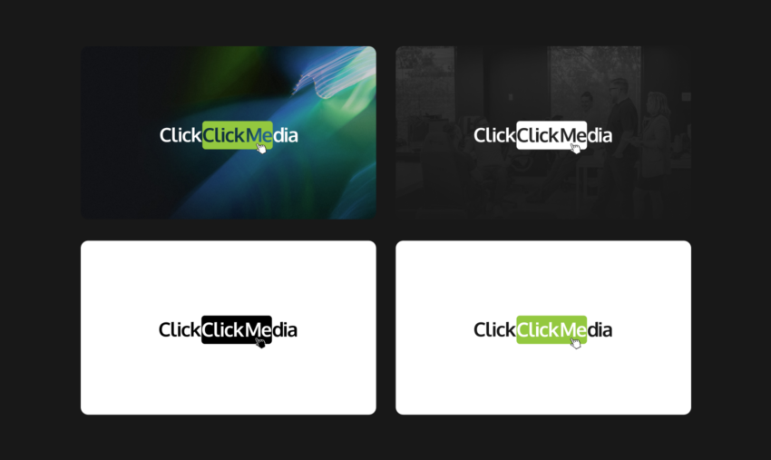
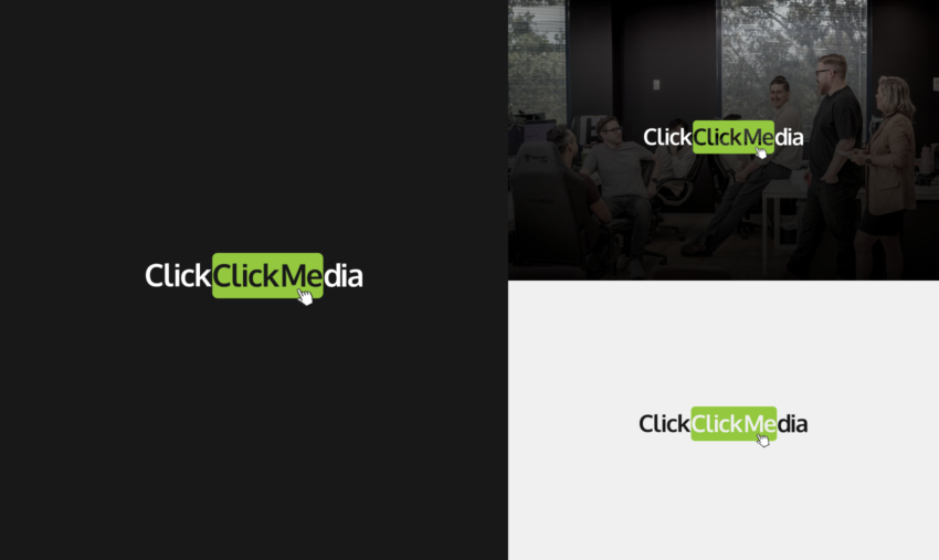
2. Approved Logo Variations
To maintain flexibility across backgrounds and layouts, the following logo variations are approved for use.
Full Colour on Light Background
- Black and dark-grey text
- Green highlight block
- White background
This is the preferred version for most applications.
Full Colour on Dark Background
- White text
- Green highlight block
- Designed specifically for dark or black backgrounds
Use this version when the logo appears over dark photography, video, or solid colour backgrounds.
Monochrome (White)
- Entire logo rendered in white
Approved for:
- Dark backgrounds
- Video end frames
- Situations where colour reproduction is limited
Monochrome (Black)
- Entire logo rendered in black
Approved for:
- Single-colour print applications
- Internal documents
- Watermarks where subtlety is required
No other colour variations are permitted.
3. Clear Space Requirements
To preserve legibility and visual impact, the logo must always be surrounded by adequate clear space.
- Minimum clear space is equal to the height of the letter “C” in “Click”
- No text, imagery, or graphic elements may enter this space
- Clear space applies on all sides of the logo
4. Minimum Size
To ensure readability:
- Digital minimum width: 120px
- Print minimum width: 30mm
Do not scale the logo below these sizes.
5. Background Control
The logo must always appear on backgrounds that provide sufficient contrast.
Approved backgrounds:
- White
- Black
- Solid neutral colours
- Clean photography with minimal visual noise
Avoid placing the logo over:
- Busy or high-contrast imagery
- Patterns or gradients that reduce legibility
- Brand colours that clash with the green highlight
6. Cursor Icon Usage
The cursor icon is a core part of the Click Click Media identity and must remain:
- Attached to the logo
- Proportionally scaled
- Positioned exactly as supplied
The cursor icon must not be removed, redrawn, animated independently, or used as a standalone brand mark unless explicitly approved.
7. Incorrect Usage
The following treatments are not permitted under any circumstances:
- Changing logo colours
- Applying gradients, shadows, or outlines
- Distorting, stretching, or skewing the logo
- Reordering or separating logo elements
- Replacing the cursor icon
- Placing the logo inside shapes not provided in official assets
- Rotating the logo
8. File Formats
Use the correct file format for each application:
- SVG: Preferred for digital use
- PNG: Digital use where transparency is required
- JPG: Only when transparency is not needed
- PDF or EPS: Print production
Always use the master logo files supplied by Click Click Media.
9. Accessibility & Legibility
- Ensure sufficient colour contrast for accessibility compliance
- Avoid reducing opacity below 100%
- Do not place the logo over text
10. Approval & Questions
If you are unsure which logo version to use, or if a new application falls outside these guidelines, approval must be sought before use.
Please contact the Click Click Media brand or marketing team for clarification or additional assets.
This guide applies to all Click Click Media partners, clients, suppliers, and internal teams.