How Colour Choices Impact Conversions on Your Website

You’ve invested in sharp copy, a clean layout, and a solid user experience. But if your colour choices are working against you, none of that effort is hitting its full potential. Colour isn’t just decoration. It’s one of the most powerful psychological tools you have for influencing how visitors feel, what they trust, and whether they click that button or bounce.
Let’s break down how colour actually drives (or kills) conversions, and what you can do about it.
First Impressions Happen in Milliseconds
Research suggests that people form opinions about a website in roughly 50 milliseconds, well before any conscious thought kicks in. And colour is one of the first things the brain processes. Studies have found that up to 90% of snap judgements about products can be based on colour alone, and around 75% of people evaluate a business’s credibility based on its website design.
What that means in practice: your colour palette is shaping perceptions of your brand before a single word of your copy gets read. If the palette feels off (too aggressive, too bland, too chaotic) visitors have already started forming a negative impression. This is exactly why strategic web design matters so much. Every pixel, every shade, every contrast ratio is part of the conversion equation.
The Psychology Behind the Palette
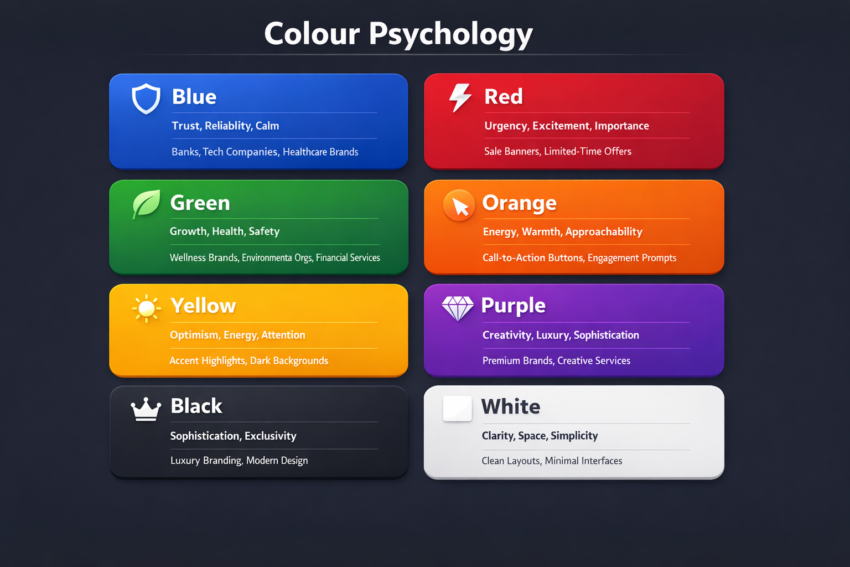
Different colours trigger different emotional responses, and those responses influence behaviour. Here’s a quick overview of the most commonly used colours in web design and the associations they tend to carry:
Blue is overwhelmingly popular among banks, tech companies, and healthcare providers for good reason. It’s associated with trust, reliability, and calm. If your brand needs to convey stability and professionalism, blue is a safe and effective foundation.
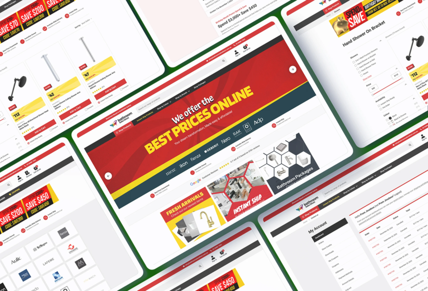
Red creates urgency, excitement, and a sense of importance. It works brilliantly for sale banners and time-sensitive offers, but use it sparingly. Too much red on a page can feel aggressive or overwhelming, which pushes visitors away rather than pulling them in.
Green signals growth, health, and safety. It’s a natural fit for wellness brands, environmental organisations, and financial services. Green also carries a psychological “go” signal, which is why it performs well on action-oriented buttons in certain contexts.
Orange balances energy with approachability. It’s warm, sociable, and encourages action without the intensity of red. Many high-performing call-to-action buttons use orange because it grabs attention while still feeling friendly.
Yellow evokes optimism and energy but needs to be handled carefully. The wrong shade or too much of it can feel cheap or strain the eyes. Used as an accent, particularly on darker backgrounds, it can be highly effective at drawing attention.
Purple leans into creativity, luxury, and sophistication. It’s a strong choice for premium brands or services that want to stand out from the standard blue-and-white corporate look, though it can be polarising if overused.
Black and white remain the foundation of clean, modern design. White creates spaciousness and clarity, while black conveys sophistication and exclusivity. Together, they let your accent colours do the heavy lifting.
It’s worth noting that these associations aren’t universal. Cultural context matters. A colour that signals luxury in one market might carry entirely different connotations in another. If you’re targeting an international audience, it’s worth researching how your palette translates across cultures.
The CTA Button: Where Colour Meets Revenue
If there’s one place on your website where colour choice has the most direct impact on conversions, it’s your call-to-action buttons. This is where psychology meets hard data, and it’s a key focus of any serious digital marketing strategy.
One of the most widely cited examples comes from a well-known A/B test where a CTA button was changed from green to red. The result? A 21% increase in clicks, despite the team originally predicting the green button would perform better. Other documented tests have shown CTA colour changes producing conversion rate lifts of anywhere from 18% to over 30%.
But here’s the nuance that most “just make your button red” advice misses: it’s not about the colour itself. It’s about contrast. A red button stands out on a page that’s predominantly blue and white. A green button might outperform everything on a page that’s heavy on warm tones. The principle is simple: your CTA needs to visually pop against its surroundings.
Data from large-scale A/B testing suggests that red and orange buttons tend to generate higher click-through rates overall, likely because they create a sense of urgency and stand out naturally against most common website colour schemes. However, blue buttons have also been found to perform strongly, winning the highest percentage of tests in at least one large-scale analysis.
The takeaway? There is no universally “best” CTA colour. What matters most is that the button contrasts sharply with the page around it and aligns with the emotional tone of the action you’re asking the visitor to take.
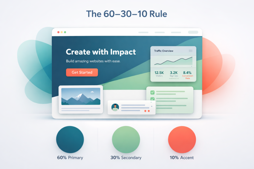
The 60-30-10 Rule
A useful framework for balancing your website’s colour palette is the 60-30-10 rule:
60% dominant colour. This is typically your background. It sets the overall tone and mood of the site. Neutral tones like white, light grey, or soft navy work well here because they give content room to breathe.
30% secondary colour. This supports the dominant colour and adds visual interest. It’s often used for sections, cards, navigation elements, or secondary headings.
10% accent colour. This is your power colour. It’s reserved for CTAs, key links, important notifications, and anything you want the visitor’s eye drawn to immediately. This is the colour that drives action, so make it count.
When too many colours compete for attention, visitors don’t know where to look. A disciplined palette keeps the visual hierarchy clear and guides the user naturally toward the actions you want them to take. Getting this balance right is a core part of effective UX design. It’s not about making things pretty, it’s about making them perform.
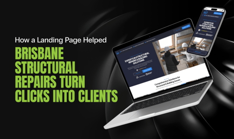
Colour and Your Landing Pages
If you’re running Google Ads or any paid media, your landing page colours deserve special attention. Visitors arriving from an ad have high intent but short patience. The colour scheme of your landing page needs to immediately reinforce trust, establish visual hierarchy, and make the desired action unmistakable.
A custom landing page that’s been designed with colour psychology in mind will consistently outperform a generic template where the palette was chosen on a whim. When your ad messaging, brand colours, and landing page design are aligned, you create a seamless experience that reduces friction and boosts conversion rates.
Colour for eCommerce: Product Pages That Convert
For eCommerce websites, colour choices become even more critical. Your “Add to Cart” button needs to stand out clearly from other page elements like rewards links, chat widgets, and product information. One documented case study found that simply differentiating the “Add to Cart” button colour from other CTAs on the page led to an 18% increase in eCommerce conversion rate.
Background colours on product pages also influence perceived product value. Clean white or light backgrounds tend to work well for lifestyle and premium products because they create a sense of space and quality. Darker backgrounds can convey exclusivity and work well for luxury or tech products. The key is ensuring your colour choices support the buying decision rather than distracting from it.
Don’t Forget Accessibility
Around 8% of men and 0.5% of women have some form of colour vision deficiency. If your CTA relies solely on colour to communicate its purpose (say, the only indicator of a required form field is that it turns red) you’re creating friction for a meaningful percentage of your visitors.
Good colour choices also mean ensuring sufficient contrast between text and backgrounds. Websites that meet accessibility standards consistently outperform those that don’t in user satisfaction metrics. Beyond being the right thing to do, accessible design directly supports better conversion outcomes. It’s something our web development team bakes into every build from day one, including Core Web Vitals compliance and WCAG accessibility standards.
Tools like the WebAIM Contrast Checker and colour blindness simulators can help you test whether your palette works for everyone, not just those with typical colour vision.
Stop Guessing. Start Testing.
Here’s the uncomfortable truth: no amount of colour psychology theory can tell you exactly what will work for your audience on your website. The emotional associations are a starting point, not a guarantee.
What does work is A/B testing. Change one variable at a time (button colour, background shade, accent hue) and let your actual visitors show you what resonates. Run the test for long enough to collect statistically significant data (generally at least a couple of weeks and a minimum of 100 conversions per variant), and resist the urge to call a winner too early.
Some practical things to test:
- CTA button colour against different page backgrounds
- Warm vs. cool colour palettes for landing pages
- The impact of reducing the number of colours on a page
- How your colour choices render on mobile screens, where users process visual information faster
Remember, a colour that works brilliantly on desktop might fall flat on a smaller screen where context and contrast shift. This is where a data-driven approach to SEO and conversion rate optimisation work hand in hand. There’s no point driving traffic to a page that isn’t optimised to convert.
Colour Is Strategy, Not Decoration
The colours on your website aren’t just making things look nice. They’re actively shaping how visitors feel about your brand, how they navigate your pages, and whether they convert. Getting this right isn’t about following trends or picking your favourite shade of blue. It’s about understanding the psychology, applying the principles, and then validating everything with real data.
At Click Click Media, we’ve spent over 16 years building websites and running campaigns that are engineered to convert. Colour strategy is just one piece of the puzzle, but it’s a piece that too many businesses overlook. If your website isn’t performing the way it should, sometimes the fix is simpler than you think.
Ready to turn your website into a conversion machine? Get in touch with our team and let’s talk about what’s really going on under the hood.