The Ultimate Checklist for High-Converting Homepage Design

Your homepage is the most important page on your website. It’s your digital front door, your first impression, and, whether someone comes from Google, social media, or word-of-mouth, often the deciding factor in whether they stay or leave. In just a few seconds, visitors make a judgment about your credibility, professionalism, and whether you can help them.
A high-converting homepage isn’t about being trendy or overdesigned. It’s about clarity, intention, and user experience. This guide gives you a complete, practical checklist to help you optimise your homepage for trust, conversions, and ease of use, with no design degree required.
Why Your Homepage Matters More Than You Think
Your homepage has one job: guide visitors toward the next step.
A great homepage answers:
- Who are you?
A weak homepage leaves visitors confused or overwhelmed, resulting in high bounce rates and lost leads. A strong homepage, on the other hand, removes friction and clearly communicates value, making it one of the fastest wins for improving conversions.
Use the following checklist to audit or rebuild your homepage. Each item includes practical examples and best practices.
1. Craft a Clear Value Proposition
Your value proposition is the backbone of your homepage. It answers three crucial questions in under 5 seconds:
- What do you do?
A strong value proposition reduces confusion, increases trust, and helps users instantly understand whether they’re in the right place.
How to craft a strong value proposition:
- Keep it to one concise sentence.
Example
Weak: “Innovative digital solutions for today’s businesses.” This could describe a tech firm, agency, SaaS platform, or consultancy—not helpful.
Strong: “We help small businesses grow through strategic SEO, Google Ads, and high-performance web design.” Now the visitor knows exactly what you do and who you serve.
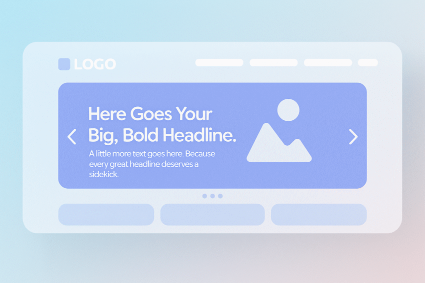
2. Use a Strong, Benefit-Focused Hero Headline
Your hero headline is the most-read element on your homepage. Its job is simple: communicate the main outcome your product or service delivers.
Why this matters
Visitors decide whether to scroll or leave based on your headline alone. A weak headline loses attention; a strong headline signals immediate relevance.
Best practices:
- Lead with a benefit, not your brand name.
Example
Weak: “We Are TechFix Solutions.” This tells users nothing useful.
Strong: “Fix your IT problems fast with same-day business support.” Specific. Benefit-driven. User-focused.
3. Add a Supporting Subheadline
Your subheadline should clarify how you deliver the benefit promised in your headline. Think of it as the connector between your headline and your main CTAs.
What a good subheadline includes:
- A simple explanation of your service or product
Example
“24/7 monitoring, rapid incident response, and proactive maintenance to keep your business running smoothly.” It expands on the headline without overwhelming the user with detail.
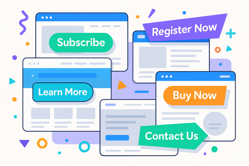
4. Optimise Your Above-the-Fold CTA
Above the fold—everything visible without scrolling—is prime real estate. Your CTA must be visible, strong, and easy to understand.
Best practices:
- Place your primary CTA prominently (top right + hero section).
What to avoid:
- “Learn More” (too vague)
Example:
Primary CTA: “Book a Free Demo”
Secondary CTA: “Watch Video Overview”
5. Showcase Immediate Social Proof
Social proof is one of the most powerful trust-builders on your homepage. People trust brands other people trust.
Types of social proof to include:
- Customer logos (“Used by 400+ Australian businesses”)
Placement:
- Above the fold if possible
Why it works:
Social proof reduces perceived risk and validates your claims—critical for conversions.
6. Create a Clean, Intuitive Navigation
Navigation should guide users—not confuse them. Complex navigation increases bounce rates and cognitive load.
Best practices:
- Limit top-level menu items to 4–6.
Avoid:
- Mega menus with 30+ links
Your navigation should behave like a good tour guide—clear, predictable, and easy to follow.
7. Apply Strong Visual Hierarchy & Scannability
Most visitors scan before they read. A high-converting homepage uses hierarchy to guide the eye.
Tools for visual hierarchy:
- Larger, bold headlines
Example
Headline: “Why hundreds of businesses trust us”
Subheadline: “We deliver consistent results, clear communication, and measurable ROI.”
Bullets:
- Dedicated account manager
- Monthly reporting
- Proven industry frameworks
8. Maintain Brand Consistency
Consistency signals professionalism and reliability. Inconsistency signals sloppiness.
Check for consistency in:
- Colour palette
A homepage using five different fonts and six button styles creates visual noise. Your homepage should feel polished, intentional, and aligned with the rest of your brand.
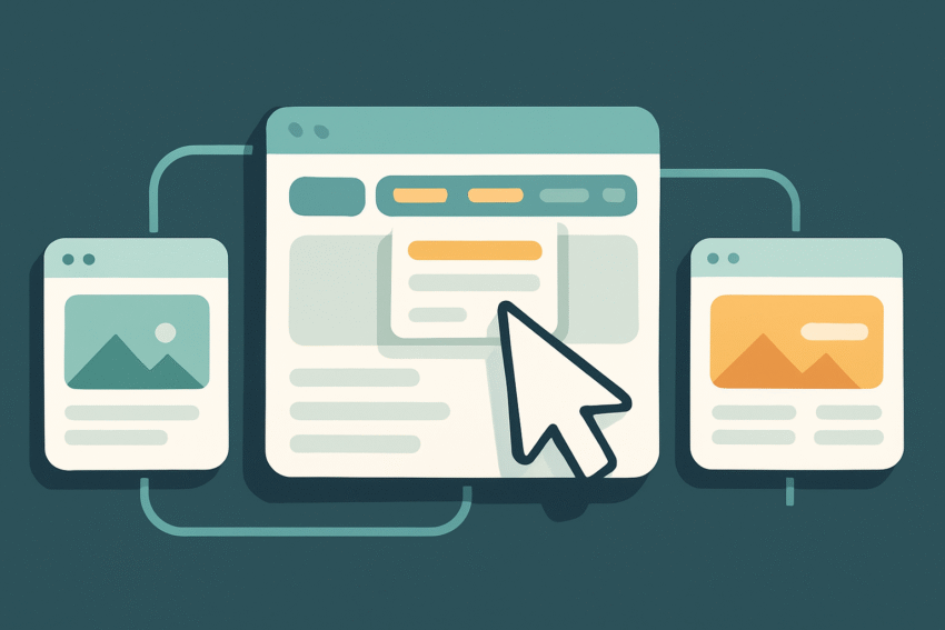
9. Optimise for Mobile Experience
With most users browsing on mobile, your homepage must work flawlessly on smaller screens.
What to look for:
- Buttons large enough for thumbs
Bonus:
Use a sticky CTA bar on mobile (if appropriate) to increase conversion opportunities.
10. Improve Page Speed & Performance
Slow load times are conversion killers. Every second matters.
Speed best practices:
- Compress JPG/PNG images
Speed benchmarks:
- Under 2 seconds = ideal
Even a beautiful homepage won’t convert if it loads like dial-up.
11. Add Trust Signals
Trust is everything—especially for visitors unfamiliar with your brand.
Trust-building elements include:
- Security badges (SSL, secure checkout)
These elements reduce anxiety and reassure users that your business is legitimate.
12. Remove Jargon & Prioritise Message Clarity
Clarity converts. Confusion kills conversions faster than anything else.
Avoid:
- Corporate jargon (“end-to-end solutions”, “synergistic frameworks”)
Embrace:
- Short, direct sentences
Example
Confusing: “We provide integrated end-to-end solutions that leverage omnichannel frameworks to enhance scalability.”
Clear: “We help you get more leads with SEO, Google Ads, and high-converting websites.”
If a user has to stop and think, they stop converting.
13. Add Intent-Led Sections Below the Fold
Once users understand who you are and what you offer, they scroll to learn more. Below-the-fold sections should guide them through a logical journey.
Essential below-the-fold elements:
- How It Works
- Simple 3-step process
- Helps users understand what happens next
- Simple 3-step process
Why this matters:
These sections reduce friction, answer questions, and prepare users emotionally to convert.
Summary
A high-converting homepage isn’t built on guesswork—it’s built on clarity, structure, and psychology.
Here’s your simplified checklist:
- Clear value proposition
When in doubt: simplify, clarify, and guide the user toward the next step.
Ready to Transform Your Homepage into a Conversion Engine?
Every day with a weak homepage costs you leads. Contact us now for a free consultation and start converting more visitors this week.