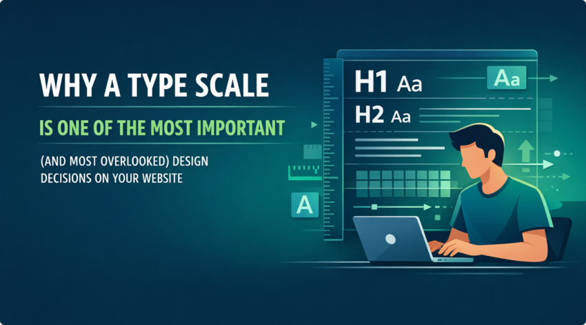
Why a Type Scale Is One of the Most Important (and Most Overlooked) Design Decisions on Your Website
Most business owners spend a lot of time thinking about their logo, their brand colours, and their photography. Very few think about their type scale. That’s a mistake, and it’s one that quietly costs websites conversions every day.
Typography is not just about choosing a font. It’s about creating a visual hierarchy that tells your visitors exactly where to look, what to read next, and what to do. A well-structured type scale is the invisible framework that makes all of that possible. It’s a foundational part of great web design, and yet it’s one of the first things cut when sites are built in a hurry.
What Is a Type Scale, Exactly?
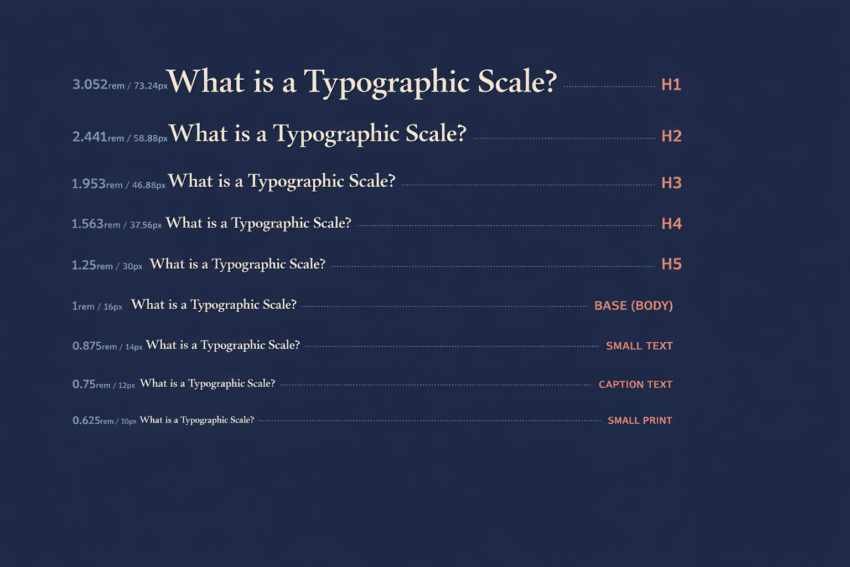
A type scale is a set of predetermined font sizes for your H1, H2, H3, body copy, captions, labels, and everything in between, following a consistent mathematical ratio. Rather than picking sizes at random, a type scale ensures every level of your typography relates harmoniously to the one above and below it.
Common ratios include the Major Third (1.250), Perfect Fourth (1.333), and the Golden Ratio (1.618). A Minor Third (1.200) is a popular choice for interfaces where space is tight. The exact ratio matters less than the consistency and intention behind it.
In practice, a type scale might look something like this on a website:
- H1 (Page title): 52px
- H2 (Section heading): 40px
- H3 (Sub-heading): 32px
- H4: 24px
- Body copy: 18px
- Small / captions: 14px
Every size has a purpose. Every size earns its place. Nothing is arbitrary.
Why This Matters More Than You Think
1. It Creates Visual Hierarchy Instantly
When a user lands on your site, they scan before they read. Research consistently shows that people skim web pages in an F-pattern, picking up headings and skipping through to find what’s relevant. A clear type scale creates signposts that guide that scanning behaviour, pulling the eye down the page in the direction you want it to go.
When headings are poorly differentiated (say, your H1 is 28px and your H2 is 24px), users can’t tell what matters most. The hierarchy collapses, and so does engagement. This is exactly the kind of friction our UX design process is built to eliminate.
2. It Builds Brand Credibility Without a Word
There is a reason that premium brands invest heavily in typography. Consistent, well-proportioned type signals professionalism, attention to detail, and authority, all before a visitor has read a single sentence. On the flip side, inconsistent heading sizes, cramped body copy, or oversized fonts that clash across pages can make even a well-resourced business look amateurish.
Your typography is sending a message. A type scale ensures it’s the right one. It’s one of the reasons custom web design always outperforms a template: every typographic decision is made with your brand and your audience in mind, not borrowed from a generic theme someone else built for a different business.
3. It Directly Affects Readability and Dwell Time
Body copy that’s too small strains the eye. Body copy that’s too large feels informal and bloated. The same applies to heading sizes relative to the text that follows them. When the relationship between your headings and body text is proportional and consistent, reading becomes effortless. When it’s not, readers disengage, often without knowing why.
Google measures dwell time. Dwell time influences rankings. Typography affects dwell time. The chain is direct.
4. It Keeps Your Site Consistent at Scale
If your website has 20 pages and no type scale, each page is a small design decision waiting to happen. A developer adds a new section and guesses at a heading size. A content manager writes a new blog post and the subheadings feel slightly off. Over time, the site becomes visually inconsistent, not dramatically, but enough to erode the sense of polish that builds trust with visitors.
A defined type scale solves this by removing guesswork. Everyone working on your site, including designers, developers, and content editors, is working from the same system. The result is a coherent, consistent experience no matter how large your site grows.
5. It Supports Accessibility and SEO
Accessibility is not optional. WCAG 2.2 guidelines set minimum requirements for readable font sizes and sufficient contrast. A type scale that starts with a well-considered base size (typically 16–18px for body copy) and scales upward gives you a foundation that’s readable for everyone, including users with visual impairments.
From an SEO perspective, Google’s crawlers use heading hierarchy (H1, H2, H3) to understand the structure and topics of your content. A site built on a clear type scale naturally reinforces proper heading hierarchy, which supports stronger content signals and better rankings. It’s one of many on-page factors our team addresses as part of every build.
The Common Mistakes We See
After building and auditing hundreds of websites, a few type-related patterns consistently show up on underperforming sites.
Too many font sizes with no system. Designers pick a new size for each element rather than drawing from a shared scale. The result is visual noise.
H1s that don’t feel dominant enough. If your main page heading doesn’t clearly sit at the top of the hierarchy, visually bigger, bolder, and more commanding than everything below it, visitors don’t get the anchor they need to orient themselves on the page.
Body copy that’s too small on mobile. What reads comfortably at 16px on desktop can feel cramped on a 375px-wide phone screen. A proper type scale accounts for responsive sizing across breakpoints. Every site we build is tested across real devices before it goes live.
Heading levels used for styling, not structure. Jumping from an H2 straight to an H4 because it looks better is a common shortcut that confuses both users and search engines. Semantic heading structure and visual hierarchy need to work together.

What a Properly Implemented Type Scale Looks Like
A type scale isn’t just a list of sizes. It’s a system that lives in your CSS or design tokens, applied consistently across every page. In a well-built WordPress or Webflow site, heading styles are defined globally. Changing the H2 size in one place updates it everywhere, instantly.
When we build or redesign a website at Click Click Media, defining the type scale happens before a single page is designed. It’s a foundational decision, as important as the colour palette or the grid system, because it shapes every piece of content that follows.
The Bottom Line
Your website’s typography is not decoration. It’s architecture. A defined type scale gives your site structure, consistency, readability, and credibility, all of which translate directly into better user experience and better commercial performance.
If your current site was built without a deliberate type scale, there’s a good chance it’s working against you in ways that are hard to see but easy to measure.
We’re happy to take a look. Book a free discovery session with our design team and we’ll show you exactly what’s holding your site back, typography included.