
How We Rebuilt the Website Behind Australia’s Sleep Specialists
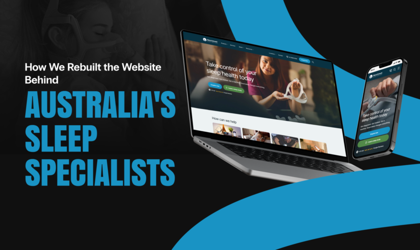
Some businesses do life-changing work but have a website that gets in the way. Benchmark Sleep Services was one of them.
Benchmark is one of Australia’s most established sleep care providers. They have run sleep clinics for more than 20 years and grown from a single location to eight across New South Wales and the ACT. They diagnose sleep disorders, run home and lab based sleep studies, and fit patients with the right CPAP machines and masks for their needs. They are a ResMed Australian Authorised Dealer and a Sleep Health Foundation approved supplier of CPAP therapy. Their General Manager, Christian Rabatsch, has specialised in sleep disorders since 1990.
That is a serious, credible offer. Their old website did not show it.
So we rebuilt it from the ground up. New design, cleaner structure, and a custom online assessment tool that replaced a frustrating paper form. Here is what we changed, and why each change matters for patients and for the clinics.
A Trusted Clinic, Held Back By a Tired Site
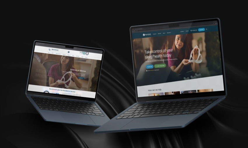
Benchmark’s old site worked, but it made simple things hard and it did not reflect the quality of the business behind it.
The design looked dated. The homepage led with a slogan, “Science of Silence,” that sounded nice but told a new patient nothing about what to do next. The navigation was crowded. Links like “Apnea Seal,” “Special Deals,” “Diagnostic Services,” “Rental,” and “Review” all competed for attention in one long row. A first time visitor had to read the whole menu to find the three things they actually wanted: products, services, and the nearest clinic.
The products page was a plain grid with a basic category list down one side. It leaned on a search box and a short set of filters. If you wanted to compare ResMed machines, or find a specific mask, or just see the full range, you had to work for it.
There was also a bigger problem hiding in plain sight.
Before Benchmark can arrange a sleep study, patients need to complete a set of clinical screening questionnaires. The old site handled this with a PDF. Patients had to download it, print it, fill it in by hand, and carry it to their GP for review and a signature. It was awkward for patients. It was awkward for the GPs. And it was awkward for the clinics, who then had to read handwritten answers back off paper and key them in.
For a business built on making sleep easier, the very first step was a chore.
The brief came down to three things. Modernise the look so it matches the expertise behind it. Rebuild the navigation so patients can move through the site without thinking. And turn that manual PDF into something a patient or a GP can complete online in a few minutes.
We Started with the Patient, Not the Page
We treated this as more than a fresh coat of paint.
A sleep clinic website has two jobs. It has to reassure a nervous new patient that these are the right people to trust with their care. And it has to move that patient smoothly from “I think I have a problem” to “I have booked an assessment.” Every decision we made was measured against those two jobs.
That meant starting with the patient journey, not the page templates. Where does a new patient land? What do they need to see first? What is the one action we want them to take? Then we built the design, the navigation, and the assessment tool to serve that path.
What We Built
A Homepage That Earns Trust in Seconds
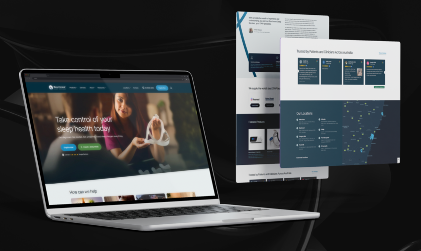
We designed and developed a brand new website, built on WordPress so the Benchmark team can manage it with confidence.
The new homepage leads with a single, calm promise: “Take control of your sleep health today.” A short line underneath does the heavy lifting: “Get diagnosed. Get treated. Get a machine. Good sleep changes everything.” That is the entire patient journey in eight words, right at the top of the page.
Below the hero, the page is built as a series of clear, purposeful sections that guide a patient down the page:
- How can we help. Four simple cards covering CPAP machines, masks, sleep diagnostics, and rentals, each with a direct link into that part of the site.
- You might also be looking for. A row of quick links to the specific things people search for, like CPAP, BIPAP, APAP, MyTAP, oxygen concentrators, masks, and body positioner devices. This catches patients who already know the term they are after.
- A word from the General Manager. Christian Rabatsch’s profile and background, front and centre, because trust in sleep care is personal.
- Three trust pillars. Experienced clinicians, leading CPAP technology, and personalised patient support. Short, confident, and reassuring.
- The brands we supply. ResMed, Fisher and Paykel, BMC, Philips, and Lowenstein, each with a link straight into that brand’s range.
- Featured products, real reviews, and all eight locations. So patients leave the homepage knowing the range is broad, the service is trusted, and there is a clinic near them.
The layout is open and uncluttered. Real photography replaces stock filler. The clinical trust markers, the ResMed and Sleep Health Foundation badges, sit where people can see them. The whole thing now feels like a health provider you would happily hand your care to.
Six Clear Paths, No More Hunting
We cut the clutter and rebuilt the menu around what patients actually look for.
The main navigation is now six clear items: Products, Services, About, Resources, Locations, and Contact. That is it.
Each one opens into a tidy, logical menu. Products expands into machines, body positioner devices, oxygen concentrators, masks, mandibular advancement (MyTAP), and packages, plus a link to see everything. Locations expands into all eight clinics, so a patient can jump straight to Bella Vista, Eastwood, Gregory Hills, Hurstville, Miranda, Phillip, Port Macquarie, or St Leonards. Resources gathers the blog, FAQs, and testimonials in one place.
We carried the same clarity into the mobile menu, so the experience holds up on a phone, which is where a lot of health searches happen.
Fewer choices. Clearer paths. Less friction between a patient and the thing they came for.
A Products Page You Can Actually Browse
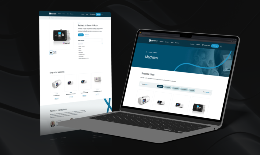
We reorganised the products page so people can actually browse it.
The new page opens by showing the brands and categories Benchmark supplies, then drops into a full product catalogue under “All Products.” From there, patients get real control. They can filter the range by category with a single tap, using clear chips for All Products, Machines, Masks, MyTAP, Concentrators, and Body Positioner Devices. They can narrow by brand from a dropdown. And they can sort the results to suit how they like to shop.
Finding a ResMed AirSense, a Philips concentrator, or a Fisher and Paykel mask now takes seconds, not scrolling.
It respects the patient’s time. It also makes Benchmark’s range look as broad and credible as it truly is, which matters when someone is comparing suppliers.
Two Forms, so the Right Clinic Gets the Lead
We split the forms, and it makes a real difference to how the clinics run.
Before, a serious treatment enquiry and a general “quick question” landed in the same inbox. That made follow-up slower and easy to muddle. Now the “Enquire Now” flow is separate from the general Contact Us form. The enquiry form even lets a patient pick their preferred clinic from the eight locations, so the right team gets the lead. Product and package enquiries route cleanly too.
The result is faster, better organised follow up, and patients who feel heard instead of lost in a shared inbox.
The Paper Form, Reborn as a Three-Minute Assessment
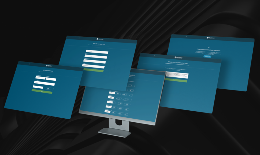
This was the centrepiece of the whole project.
We turned Benchmark’s paper questionnaire into a guided, custom-built online sleep assessment that patients and their GPs or physicians can complete on any device. It runs as a friendly step-by-step form and takes around three minutes.
Crucially, it gathers everything a clinic needs to arrange the right sleep study, in one structured place:
- Patient details, including height, weight, and neck measurement, with BMI worked out automatically.
- The service they are after, whether that is a home-based sleep study for suspected apnoea or a sleep physician consultation. If they are unsure, they pick what feels closest, and the clinic guides them.
- A full symptom checklist, covering snoring, insomnia, witnessed apnoeas, morning headaches, fatigue, and more.
- Relevant health background, such as atrial fibrillation, respiratory conditions, or neurological history, because these can change the type of study a patient needs.
- GP or physician details, with a signature field, so a referring doctor can review and sign off in the same flow.
Then it runs the three clinical screens that matter, built right into the form:
- The Epworth Sleepiness Scale (ESS), the standard measure of how likely a person is to doze off through the day. You can read about the scale on the official ESS website, developed by Dr Murray Johns in Melbourne.
- The STOP-Bang Questionnaire, a widely used screen for obstructive sleep apnoea risk.
- The OSA 50 Screening Questionnaire, a second validated apnoea screen.
Each screen tallies its own score as the patient works through it, so nothing has to be added up by hand later.
Finally, the tool runs a quick Medicare eligibility check. If the patient qualifies for a Medicare-supported sleep study, the path is clear. If they do not, the flow does not leave them stranded. It routes them to a sleep physician consultation to work out the right next step.
The impact is felt at every point in the chain. For patients, a stressful bit of paperwork became a few taps on their phone. For GPs, a printout to sign became a clean process they can complete with the patient and sign off in one go. And for Benchmark, handwriting on paper became structured, legible data that flows straight to the right clinic. This is exactly the kind of built for purpose tool a generic template site can never offer.
Maps and Reviews that Answer the Big Questions
We added two integrations that make the site more useful and a lot more convincing.
First, we connected the Google Maps API so every one of the eight clinics displays on an interactive map. Patients can see exactly where each location sits and how to get there, which removes a real barrier for someone deciding whether a clinic is close enough to visit.
Second, we surfaced Benchmark’s real Google Reviews on the site through Trustindex. Their 4.8 star rating now sits front and centre as live social proof, pulled straight from Google rather than typed in by hand and left to go stale.
Both are quality of life wins. Together they answer the two questions every new patient has before they commit: can I trust these people, and where do I go?
One Design System to Hold it All Together
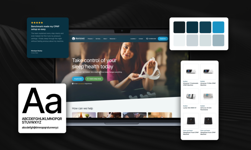
A rebuild is only as strong as the system underneath it. So we built a proper one, and documented it, so the site stays consistent as it grows.
Typography. We set the whole site in Inter, a clean, highly legible typeface that reads beautifully on screens of every size. We defined a full type scale, from a large display size at the top of key pages, down through five heading levels, body copy, and small text and label styles. We also tuned a separate set of heading sizes just for mobile, so a heading that commands attention on a laptop still feels right, and stays readable, on a phone in a waiting room. Consistent type is quiet work, but it is the difference between a site that feels considered and one that feels thrown together.
Colour. The palette runs on a spine of deep navy and teal, drawn from Benchmark’s brand, and softened with cool grey blues, a light off white, and plenty of white space. We then gave the important actions their own clear colours. A bright blue carries the main calls to action, like “Book a visit” and “View the range.” A warm green flags the “I have a referral” path, so patients coming in through their GP spot the right button straight away. Small, muted pills handle secondary labels like “Sleep Apnea” without stealing focus.
The result is a look that feels clinical in the best sense of the word. Calm, clear, and professional, with the actions that matter always easy to find.
Where Benchmark Landed
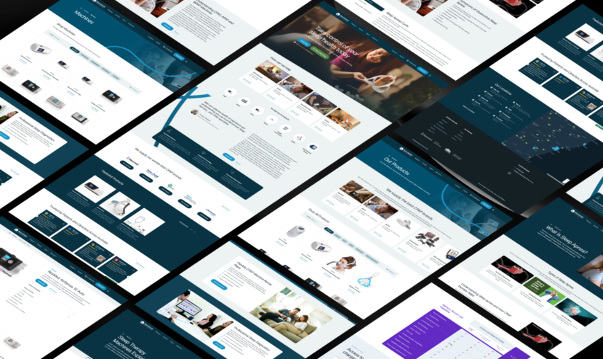
The new Benchmark Sleep Services website is live and serving patients across all eight clinics.
The visible wins are easy to list. A modern, patient first design that finally matches the expertise of the business. Navigation that takes people to products, services, and locations without a hunt. A product catalogue built for real browsing and comparison. Separated enquiry routing, with a preferred clinic picker, so the team responds faster and to the right patient. An interactive eight clinic map and live 4.8 star reviews, building trust on every page. And a documented design system in Inter that keeps the whole thing consistent as Benchmark adds pages and products.
The biggest win is harder to screenshot but easy to feel. The step that used to be a printed, hand-filled PDF is now a three-minute online assessment that patients and GPs can complete together, with the ESS, STOP-Bang, and OSA 50 built in and a Medicare check at the end. That is a smoother, less stressful start to treatment for every new patient, and cleaner, structured data for every clinic.
Benchmark’s whole promise is that good sleep changes everything. Now their website lives up to it.
Want a Website That Works This Hard?
We help Australian businesses turn dated websites into tools that genuinely move the needle. Cleaner design, smarter user journeys, and the custom features your customers actually need, built by an in house team under one roof.
See more of our work in our design portfolio and case studies, or get in touch and let’s talk about your project.