
Raising a Glass to Better UX: Jacob’s Creek’s Global Web Launch
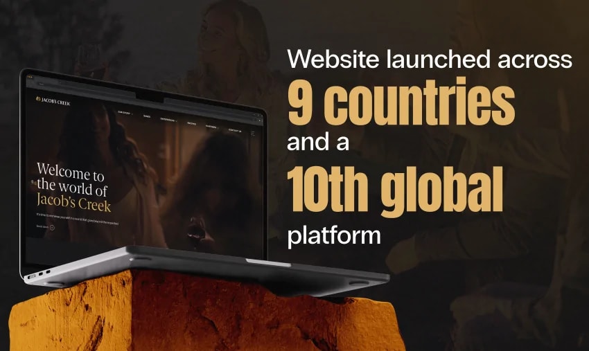
When Jacob’s Creek, one of Australia’s most recognised wine brands, needed to launch a unified, multilingual website across 9 countries and a global platform, they turned to Click Click Media to lead the strategy, design and execution.
This wasn’t just a web design refresh. It was the opportunity to bring Jacob’s Creek’s brand story to life across vastly different audiences — from wine lovers in the UK to emerging markets in China and Vietnam — while solving legacy UX challenges that had been holding back engagement, discoverability, and conversions.
The Challenge: Great Wine, But No Map to Find It
Jacob’s Creek is celebrated globally for producing high-quality, approachable wines. But while the brand’s presence in retail and on the table is strong, its digital experience lagged behind. The existing website felt disjointed, outdated, and lacked the polish expected from a wine label of this calibre.
To understand where the experience was falling short — and more importantly, why — we began with a deep dive into UX research. Our goal was to uncover what users were trying to do, how they behaved on the site, and where friction was holding them back. That research was led by our UX design agency.
We conducted:
- In-depth user interviews and surveys across key international markets
Through this research, a clear pattern emerged: while the site had strong visual appeal, its navigation across the site was a key barrier to user success.
Key UX Insights:
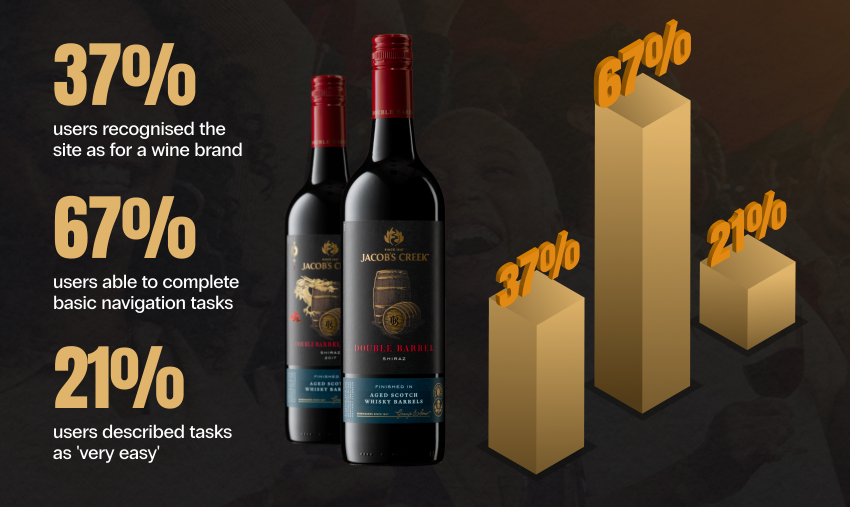
- Only 37% of users immediately recognised the Jacob’s Creek as a wine brand website — many believed they’d landed on a restaurant, food blog, or tourism site.
These insights became the foundation of our approach, shaping everything from the sitemap and menu structure to the filtering tools and mobile design patterns we would later implement.
The Solution: Blending UX Insight with Global Vision
To solve the challenges facing Jacob’s Creek’s digital presence, we knew we couldn’t simply apply a fresh coat of paint. This project demanded a comprehensive rethink — one that addressed deep-rooted UX issues, clarified brand messaging, and created a scalable, localised platform for global growth.
From user journeys to mobile-first functionality to international content mapping, every element of the redesign was guided by real user feedback, and engineered to help Jacob’s Creek tell their story, sell their wines, and connect with their audience — no matter where they were in the world.
1. Launching a Cohesive Global Platform
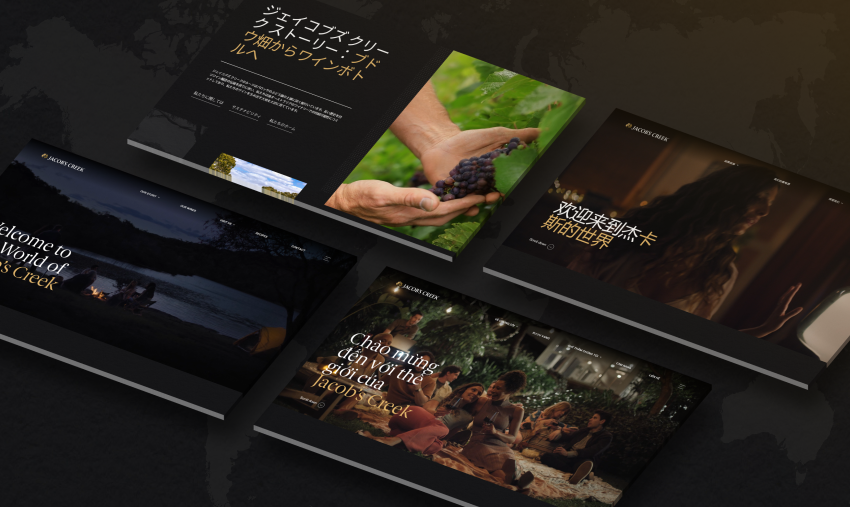
The cornerstone of our solution was the rollout of a multi-language, multi-region website framework. Jacob’s Creek had a presence in markets as diverse as the UK, Japan, Vietnam, and the United States — each with different user behaviours, wine preferences, and content needs.
We built a core global site architecture and then tailored it for ten regional versions:
- Australia, Canada, New Zealand, United Kingdom, United States, United Arab Emirates, China, Japan, Vietnam, Global site (for unlisted or general traffic)
Each version of the site was designed to feel locally relevant, while retaining a consistent global brand identity. This allowed for streamlined management, clear messaging, and market-specific flexibility — especially for differing product availability, promotions, and regulatory requirements.
2. Clarifying Brand Purpose at First Click
Our user research revealed that visitors weren’t immediately understanding Jacob’s Creek was a wine brand. To solve this, we delivered a brand-first homepage strategy:
- Hero imagery and messaging reinforced wine as the central offering.
The result was a more confident, purpose-driven first impression that oriented users from the moment they landed on the site.
3. Rebuilding Navigation from the Ground Up
Navigation was completely restructured to help users find what they were looking for faster and more intuitively.
We simplified and reorganised menus for both desktop and mobile, ensuring users were no longer confronted with scattered or duplicated categories, resulting in a much cleaner sitemap.
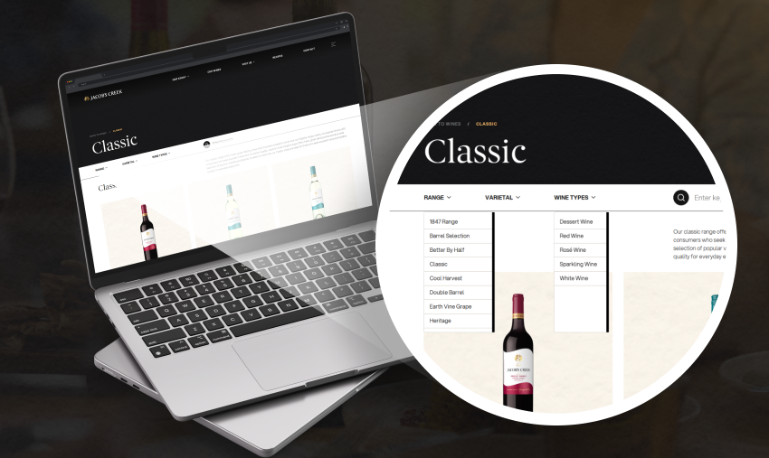
We introduced a completely reimagined product filtering system, addressing one of the biggest usability gaps. On the old site, wines were presented in a linear or randomly grouped fashion, with no meaningful way to narrow down by taste, varietal, or occasion. The result? Users either gave up or opened multiple tabs to compare options manually.
On the new site, users can now filter the wine catalogue by:
- Varietal (e.g. Shiraz, Chardonnay, Rosé)
This intuitive layout reduced cognitive load, helping users explore with confidence instead of confusion.
4. Strategic Content Elevation
Recognising that wine shopping is a discovery-driven journey, we created tools that made exploration seamless:
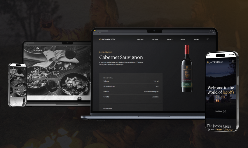
- Product pages were enhanced with clear tasting notes, food pairings, and origin details, giving users the context they need to make informed decisions.
These features transformed the experience from static browsing to dynamic discovery — supporting both seasoned wine enthusiasts and first-time buyers.
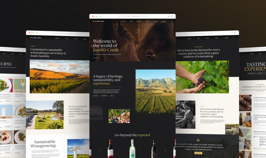
To add depth without distraction, we elevated supporting content — like recipes, sustainability, and partnerships — by:
- Placing recipes alongside wine recommendations, creating contextual inspiration.
This enriched the overall experience and reinforced the brand’s values and commitments.
5. SEO Migration & Global Strategy
From a technical SEO perspective, the relaunch presented unique complexities. Migrating a legacy site with fragmented structure into a multi-site, multi-language environment — without damaging search visibility — required a carefully orchestrated SEO migration plan.
Key actions included:
- URL mapping and redirection strategies to ensure continuity across legacy and new versions of the site.
The SEO team placed great focus on replacing JavaScript redirects with server-side logic and proper hreflang implementation, ensuring search engines could crawl, index, and understand which version of each page belonged to which market and language.
This SEO groundwork not only prevented ranking loss but provided a stronger search foundation for international growth, ensuring Jacob’s Creek could continue to attract organic traffic in every market post-launch.
The Outcome: Global, Polished, and Ready to Serve
Today, Jacob’s Creek’s website is a destination in itself. Launched across 9 countries and a tenth global version, the site now offers a consistent, intuitive, and premium digital experience — no matter where in the world users are raising their glass.
Some of the key results since launch:
- A significant reduction in bounce rate, especially on mobile.
Final Pour: What This Means for Digital-First Brands
Great design is more than just good looks. For Jacob’s Creek, success came from listening to users, learning from their frustrations, and then thoughtfully reimagining the experience.
At Click Click Media, we believe that every digital touchpoint should echo the quality of your product. Whether you’re selling wine, software, or services — your website should be your best brand ambassador.
Got a legacy brand that needs a modern refresh? Let’s talk.