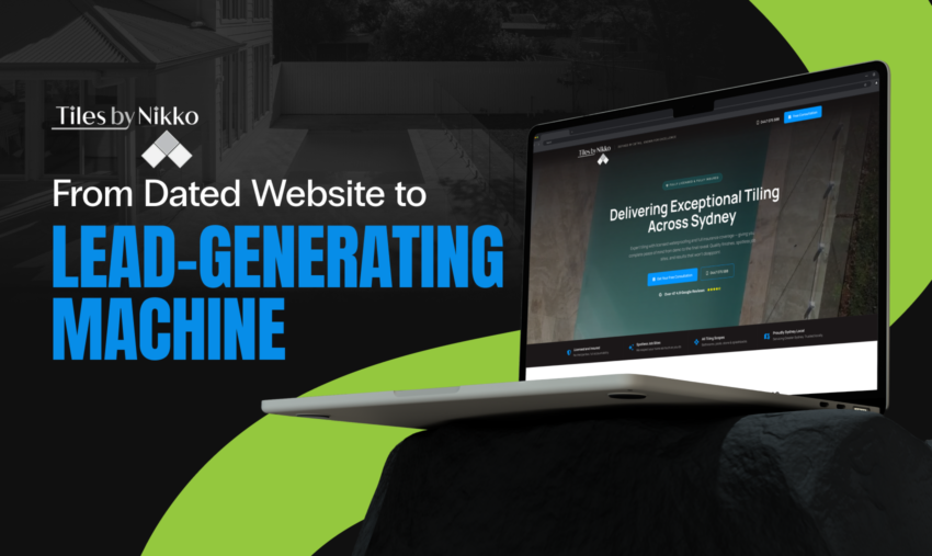
Five-Star Reputation. One-Star Website.
Tiles by Nikko is the kind of business every homeowner hopes to find. Meticulous craftsmanship. Obsessive attention to detail. The kind of team that answers the phone on the first ring and walks you through every step of the job before a single tile gets laid. Their reputation across Sydney was built on word-of-mouth. Clients who couldn’t stop talking about how different the experience was compared to every other tiler they’d dealt with.
But the website told a completely different story.
It was dated. It didn’t reflect the quality of the work. It didn’t communicate the premium, personalised service that was the business’s biggest competitive advantage. And it certainly wasn’t converting the kind of traffic that a well-run Google Ads campaign could send its way.
Tiles by Nikko came to us with a clear set of goals. They needed a digital presence that matched the calibre of their work. They wanted to position the business firmly in the premium end of the market. Not competing on price with every other tiler on Gumtree, but attracting homeowners who valued quality, communication, and a tiler they could actually trust. They also had bigger ambitions on the horizon: expanding into full bathroom renovations, with a long-term vision of growing into full house renovations.
The brief was to build a high-converting landing page that could do the heavy lifting. Something that could take cold traffic from Google Ads and turn it into qualified leads. Something that positioned Tiles by Nikko not just as a tiler, but as a premium renovation partner. And something that could eventually expand into a full website as the business grew.
The Big Question: What Makes Tiles by Nikko Worth More?
Before we touched a design file, we had to crack the core strategic question: what makes Tiles by Nikko different, and how do we communicate that in under five seconds?
The answer was sitting right in front of us. In a market full of tradies who quote over text, disappear for days, and leave you wondering what’s happening with your renovation, Tiles by Nikko’s personalised customer service was the moat. The business is fully licensed and insured. Every project is managed from concept to completion. Communication is constant. And the owner is personally involved in every job. This isn’t a franchise model where you meet the owner and then never see them again.
That insight shaped every design decision on the page.
We weren’t building a brochure website. We were building a conversion engine that needed to accomplish several things simultaneously: establish credibility instantly, communicate a premium positioning, showcase the breadth of services, and drive the visitor toward a consultation or phone call. All while feeling personal, not corporate. This is where strategic thinking and web design need to work as one, not as separate briefs handed to separate teams.
The landing page also needed to lay the groundwork for future expansion. Tiles by Nikko’s goal of moving into full bathroom renovations, and eventually full house renovations, meant the information architecture had to be scalable. We couldn’t design ourselves into a corner.
Pulling the Page Apart: Every Section, Every Decision
Let’s walk through the page from top to bottom. Nothing on this page is decoration. Every section was deliberate. Every design choice served a strategic purpose.
The Nav Bar: Always One Tap Away
The navigation bar keeps it clean and functional. The Tiles by Nikko logo sits top-left with the tagline “Driven by Detail. Guided by Excellence,” immediately setting the tone before the visitor reads a single word of body copy. The right side of the nav features a prominent phone number and a blue “Get a Free Quote” call-to-action button.
This matters more than people think. For a local trades business, the phone number needs to be visible at all times. A significant percentage of leads in this industry come through direct calls, especially from mobile users. Having the CTA button in the header means the visitor never has to scroll to take action. It’s there from the first millisecond.
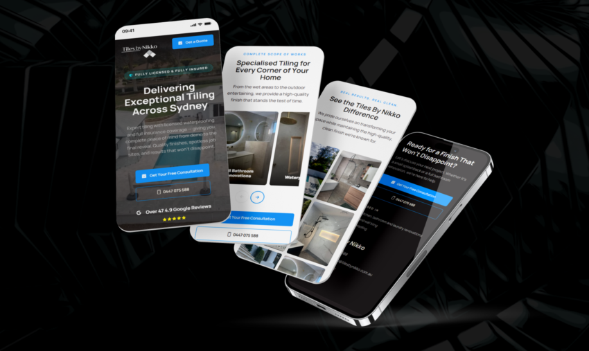
The Hero: Five Seconds to Win Them Over
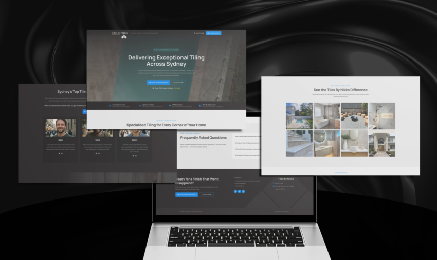
The hero is where we set the entire tone for the page. A full-width background image of a premium residential exterior (clean, modern, aspirational) with a strong headline overlay: “Delivering Exceptional Tiling Across Sydney.”
Beneath the headline, supporting copy reinforces the key value propositions before the visitor scrolls. Two prominent CTAs sit side by side: “Get Your Free Consultation” (primary, blue) and “Call Us Now” (secondary, outlined). This dual-CTA approach is deliberate. Some visitors prefer to fill out a form. Others want to pick up the phone. We accommodate both conversion paths immediately.
Below the CTAs, a trust signal: “Over 475+ Google Reviews” with a five-star rating displayed prominently. For a local trades business, Google reviews are the single most powerful trust signal available. Putting this above the fold, before the visitor has to do any work, removes one of the biggest friction points in the decision-making process.
And then the trust strip. Four key credentials run across the bottom of the hero section: Licensed & Insured, Spotless Job Sites, All Tiling Covered, and Friendly Sydney Local. These aren’t just features. They’re direct responses to the anxieties that homeowners have when hiring a tiler. Will they be insured if something goes wrong? Will they leave my house a mess? Can they handle my specific job? Are they actually local?
Each one of those anxieties gets addressed before the visitor scrolls a single pixel.
The Services Grid: Planting the Seed for What’s Next
The next section, “Specialised Tiling for Every Corner of Your Home,” lays out the core service categories in a visual grid format. Four services, each with a real project photograph: Full Bathroom Renovations, Waterproofing, Outdoor Entertaining & Pool Surrounds, and Decorative Stone Cladding. A fifth category, “All House Tiling,” ensures nothing falls through the cracks.
This section does double duty. It showcases the breadth of capabilities (Tiles by Nikko is not just a bathroom tiler), and it plants the seed for the bathroom renovation expansion. By leading with “Full Bathroom Renovations” as the first service card, we’re signalling to the market that this is a core offering, not a side service.
The real photography throughout this section is critical. Stock images kill trust in the trades industry. Every image on this page is from actual Tiles by Nikko projects, which reinforces authenticity and gives prospective clients a genuine sense of the quality they can expect.
Two CTAs close the section: “Get Your Free Consultation” and “Read Our Blog.” The blog link is a forward-thinking inclusion. It supports the eventual expansion to a full website and gives Tiles by Nikko a content marketing channel to build SEO authority over time.
Six Cards That Do the Selling: The Trust Builder
This is where we really lean into the premium positioning. Under the heading “Licensed Expertise from Concept to Completion,” we make the case that Tiles by Nikko isn’t just another tiler. The business is a comprehensive project partner.
Six feature cards lay out the key differentiators in a clean, scannable grid:
In-House Licensed Waterproofing. This is a significant competitive advantage. Most tilers subcontract waterproofing. Tiles by Nikko handles it in-house, which means complete accountability from start to finish.
Spotless Sites. Addresses one of the most common complaints homeowners have about tradies: the mess. Positioning cleanliness as a core value, not an afterthought.
Precision Craftsmanship. Speaks to the quality of the work itself. Premium clients care about precision. They notice when grout lines aren’t straight. This card tells them Tiles by Nikko notices too.
Full-Service Renovations. Again reinforcing the bathroom renovation offering and positioning the business as more than just a tiler.
Clear, Constant Communication. This is the single most important differentiator on the page. In a market where tradies are notoriously difficult to reach, Tiles by Nikko’s commitment to communication at every stage of the project is what separates them from everyone else. We gave this its own dedicated card because it deserves that prominence.
Designed by Nikko. Personal involvement. The owner isn’t just the face on the website. He’s personally involved in the design and execution of every project. For premium clients, knowing the person they hired is the person doing the work is a huge trust signal.
The design of these cards is intentionally minimal. Clean icons, short headlines, brief supporting copy. This section isn’t meant to be read word-for-word. It’s meant to be scanned. The visitor should be able to absorb all six differentiators in under ten seconds.
The Emotional Centre: “We Don’t Just Lay Tiles. We Build Relationships.”
Every section before this established credibility and communicated services. This section tells the visitor who Tiles by Nikko is as a business. And it’s where the page shifts from logic to emotion.
The headline, “We Don’t Just Lay Tiles. We Build Relationships,” is doing serious strategic work. It repositions the entire value proposition from a transactional service (I need tiles laid) to a relationship-based partnership (I need someone I can trust with my home).
The body copy expands on this, touching on the personal approach, the commitment to treating every client’s home as if it were their own, and the dedication to communication throughout the process.
This section also includes critical trust reinforcements presented as a structured list of credentials: Fully Licensed & Insured (with specific licence details), Spotless Job Site Guarantee, and a Local Sydney Guarantee. Including actual licence information is a strong trust signal. It’s verifiable, and it separates Tiles by Nikko from unlicensed operators who undercut on price.
Dual CTAs again: “Free Consultation” and “Call Us Now.” Consistent throughout the page, always giving the visitor a path to convert without scrolling.
The Proof: Real Projects, Real Sydney Homes
The “Recent Transformations Across Sydney” section serves as a portfolio. Before-and-after style project cards show real completed work, including a full bathroom renovation and an outdoor tiling and pool surround project, with brief descriptions of the scope and outcome.
This is where claims become evidence. Everything above this section is positioning. This section says: here’s what that actually looks like when it’s done.
The project cards include both the type of project (tagged as “Featured” or “New Work”) and a brief description of the transformation. For a trades business, the portfolio section often makes or breaks the conversion. Homeowners want to see work that looks like their project. They want to see quality they can trust. Real project photography from real Sydney homes delivers both.
Below the featured projects, a full-width gallery strip shows additional completed work across a variety of tiling styles, materials, and settings. This gives the visitor a broader sense of range without requiring them to navigate to a separate gallery page.
A “View All Examples” link sits beneath the gallery, teasing additional content and supporting the eventual expansion to a full portfolio section on the website.
Killing Objections Before They Kill the Conversion
The FAQ section addresses the most common questions and objections a prospective client would have: Does Tiles by Nikko have a current licence? What does Tiles by Nikko specialise in? Is Tiles by Nikko able to do waterproofing? What areas of Sydney do you service?
These aren’t random questions. Each one is a conversion barrier. If a visitor is wondering whether the business is licensed, they’re not going to fill out the form. They’re going to leave. By proactively answering these questions on the page, we remove friction from the decision-making process.
The accordion-style layout keeps the section compact. Visitors can expand the answers they care about without being overwhelmed by a wall of text. It’s clean, scannable, and functional.
The Close: One Last Shot to Convert
The closing section is a dark-background, high-contrast call-to-action block. The headline, “Ready for a Finish That Won’t Disappoint?”, is confident without being arrogant. It speaks directly to the anxiety every homeowner feels when hiring a tradesperson: the fear of being let down.
Dual CTAs one final time. The footer includes contact details, service area information, and essential business details. Clean, professional, no clutter.
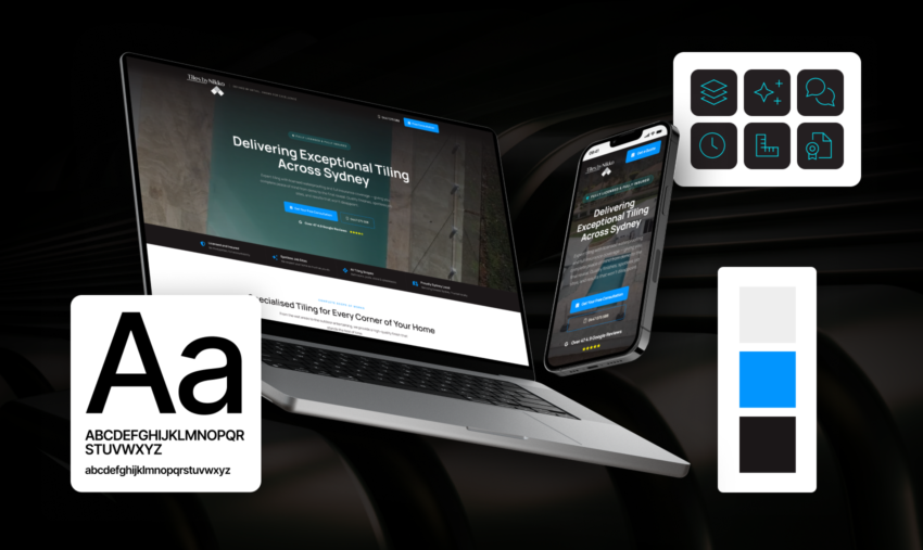
The Design Choices That Make It All Work
Looking at the page as a whole, a few design principles tie everything together.
Dark, premium colour palette. The page uses deep charcoals and blacks as the primary background colours, with bright blue CTAs that pop against every section. This colour scheme does two things: it feels premium (not the white-and-grey template look that every other tradie website uses), and it makes the real photography stand out even more. The bright, detailed project shots contrast against the dark sections beautifully. The alternating dark and light sections also create a natural visual rhythm that keeps the eye moving down the page. Colour choices shape trust and conversions more than most businesses realise.
A CTA every two scrolls. A call-to-action appears roughly every two scroll-lengths. The visitor is never more than a few seconds away from a conversion opportunity. This is critical for a landing page designed to receive paid traffic. Every scroll without a CTA is a potential drop-off point.
Zero stock images. Not a single one on the page. Every photo is from a real Tiles by Nikko project. This is non-negotiable for a trades business. Stock photos of generic bathrooms signal “I don’t have real work to show you,” which is the opposite of what a premium tiler needs to communicate.
Built for thumbs, not cursors. While the desktop design is clean and spacious, the layout is built to perform on mobile. For a local trades business running Google Ads, a significant portion of traffic (often the majority) comes from mobile devices. The phone number in the header, the click-to-call CTAs, and the vertical content flow all serve mobile users first.
Scan it in seconds. The page is designed to be scanned, not read like a novel. Short headlines. Brief supporting copy. Visual grids instead of text-heavy paragraphs. Icon-based feature cards. Accordion FAQs. Every section delivers its message in the minimum number of words required, then moves on.
The Early Numbers: Ads Are Already Converting
Since the landing page went live alongside a targeted Google Ads campaign, the early results have been very promising. The ads are converting consistently, generating qualified leads from homeowners across Sydney who are actively searching for premium tiling and bathroom renovation services.
It’s still early days. We’ll have more detailed performance data as the campaigns mature and we gather enough volume for meaningful optimisation. But the initial conversion performance has validated the strategic approach: position for premium, build for conversion, and let the quality of the work speak for itself.
The consistent lead flow from Google Ads also means Tiles by Nikko is building a pipeline that doesn’t depend entirely on word-of-mouth. That’s a significant shift for a business that previously relied almost exclusively on referrals.
What Comes Next: This Is Only Phase One
This landing page was always designed as a launchpad. The information architecture, the navigation structure, and the content hierarchy were all built with expansion in mind.
The next phase will see the landing page evolve into a full website. That means dedicated service pages for each offering: bathroom renovations, waterproofing, outdoor tiling, stone cladding, and general house tiling. It means a proper portfolio section with detailed project case studies. A blog with content designed to capture organic search traffic and establish Tiles by Nikko as an authority in the Sydney tiling market through ongoing SEO. And dedicated landing pages for specific Google Ads campaigns as the paid strategy matures.
As Tiles by Nikko grows into full bathroom renovations, and eventually full house renovations, the website will grow with them. Each new service line gets its own conversion-optimised page. Each new project gets added to the portfolio. The site becomes a living asset that compounds in value over time, both through paid traffic and organic search. That’s what happens when strategy, web, and ads work together from day one.
One Page. Every Box Ticked.
The Tiles by Nikko project is a textbook example of what a well-designed landing page can do for a local trades business. The business didn’t need a massive website with dozens of pages. It needed one page that did its job exceptionally well: communicate the quality of the work, establish trust instantly, differentiate from every other tiler in Sydney, and convert cold traffic into qualified leads.
That’s exactly what we built.
The design choices weren’t arbitrary. The dark premium palette, the real photography, the consistent CTA rhythm, the strategic feature cards, the social proof, the FAQ section. Every element serves the conversion goal. And it all starts with the strategic insight that drove the entire project: Tiles by Nikko’s biggest competitive advantage isn’t the tiling. It’s the experience of working with them.
The landing page just makes sure the right people know that before they pick up the phone.
If your landing page isn’t converting the way it should, get in touch. We’ll tell you what’s working, what isn’t, and what to do about it.