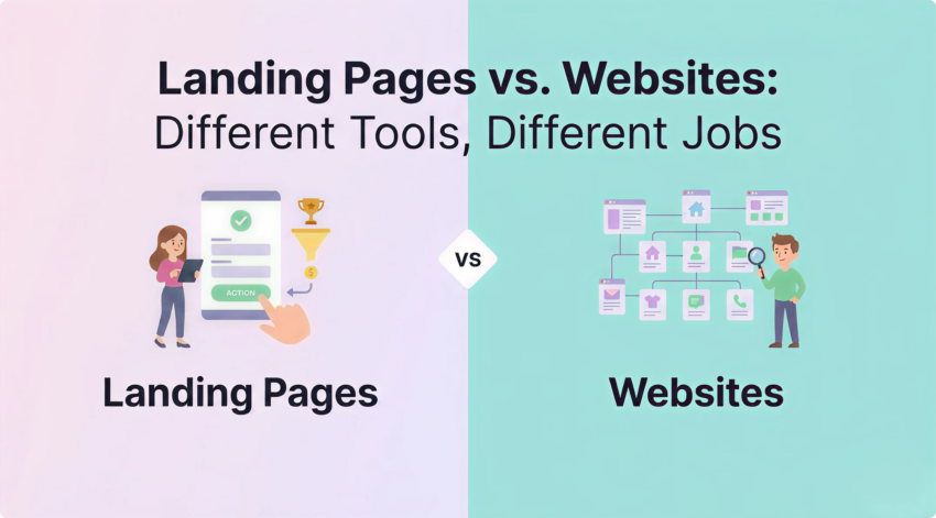
Landing Pages vs. Websites: Different Tools, Different Jobs
You’ve spent good money sending traffic to your site. The clicks are landing. But the leads aren’t.
Sound familiar?
Here’s the thing. Your website is doing its job. It’s informing browsers, building your brand, ranking in search, and serving every kind of visitor that turns up. That’s what a website is supposed to do.
But paid traffic is a different beast. It’s people who clicked one ad, expecting one answer, ready to take one action. And asking your website also to be a conversion machine for that traffic is asking it to do two jobs at once.
That’s where a landing page comes in. One goal, one audience, one path forward. Get the structure right, and you can lift conversion rates by double digits, sometimes more. Get it wrong, and you’re just lighting your ad budget on fire.
We’ve built and tested hundreds of them for Sydney businesses. Here’s what actually moves the needle.
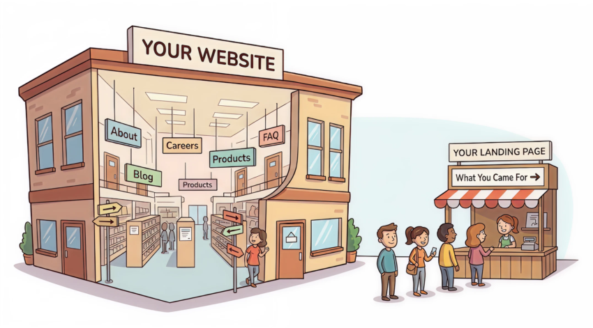
A Department Store vs. a Sales Counter (The Difference Most People Miss)
This is the bit most people get wrong before they even start.
Your website is a hub. It serves everyone. It has a navigation menu, product categories, an About page, a blog, a careers section, and maybe a chatbot. Visitors can wander wherever they like. That’s by design.
A landing page is the opposite. It’s a focused, standalone page built around a single conversion goal. There’s no menu. No footer links pulling people away. No “browse our other services” temptation. Just one promise, one audience, and one action.
Think of it this way. Your website is a department store. A landing page is a sales counter set up at the front door for one specific product, one specific buyer, on one specific day.
Why does this matter? Because the second you give someone a choice they didn’t come for, you lose them. Every extra click, every distracting link, every clever bit of cross-promotion is a leak in your funnel.
Landing pages plug the leaks.
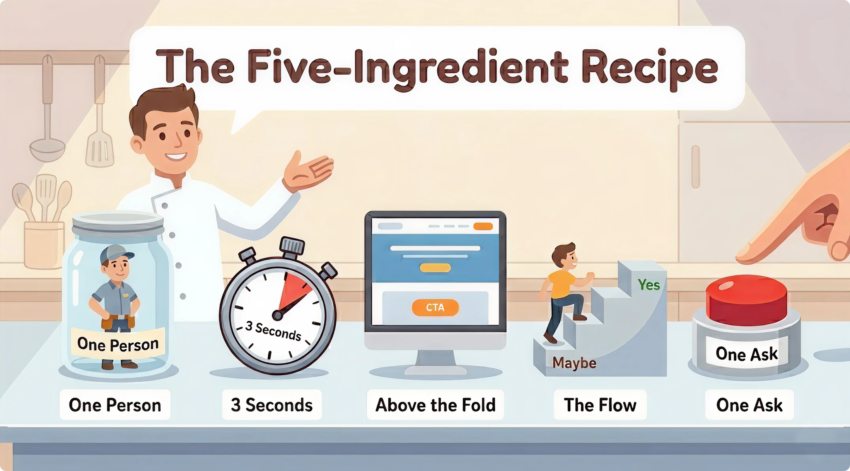
The Five Ingredients That Separate Pages That Convert From Pages That Don’t
We see the same patterns again and again. Pages that convert have these five things nailed. Pages that don’t, don’t.
1. Talk to One Person. Not Everyone.
The biggest mistake we see? Pages trying to talk to everyone.
A landing page should be built for one specific person with one specific problem. If you’re running ads for “Sydney accountants for tradies,” your page needs to speak to tradies. Not small business owners generally. Not “anyone who needs an accountant.” Tradies.
The more specific you get, the more your visitor thinks: this is for me.
And that’s the whole game.
Before you write a word, get crystal clear on three things:
- Who is this person? Job title, industry, what’s keeping them up at night
If you can’t answer those three questions in a sentence each, don’t start designing. Go back to the brief.
2. Win the First Three Seconds (Or Lose the Whole Visit)
Visitors decide in about three seconds whether your page is worth their attention. Your headline does most of that work.
A good landing page headline does two things at once. It tells the visitor exactly what they get. And it tells them why it matters to them specifically.
Weak: “Welcome to Acme Plumbing.” Strong: “Emergency plumber in Sydney’s Northern Beaches. On-site in 60 minutes or your call-out fee is on us.”
See the difference? One is a name. The other is a promise with proof baked in.
Match your headline to the ad or search term that brought the visitor here. This is called message match, and it’s non-negotiable. If your ad says “free Google Ads audit” and your headline says “Digital marketing solutions for growth,” you’ve already lost half your traffic.
3. The Top of the Page Has One Job. Don’t Give It Five.
The top of the page is your most valuable real estate. It needs to do four things before the visitor scrolls.
- Headline – what you offer and who it’s for
That’s it. No carousel of competing messages. No three buttons fighting for attention. No autoplay video with sound. Just a clear answer to the question every visitor is asking: Am I in the right place, and what do I do next?
4. Walk Them From “Maybe” to “Yes” One Section at a Time
People don’t convert because of one perfect element. They convert because the whole page walks them from curiosity to commitment.
The flow that works most of the time looks like this:
Hook them. Headline, sub-headline, hero, CTA. Make the promise.
Show you understand them. Acknowledge the problem they’re trying to solve. Use their language. Show them you get it.
Prove you can fix it. This is where benefits live. Not features — benefits. Don’t tell them you have 24/7 support. Tell them they’ll never wait on hold again when their site goes down at 11pm.
Back it up with proof. Testimonials, case studies, real numbers, recognisable client logos, industry partnerships, certifications. The more skeptical your audience, the more proof you need.
Handle the objections. What’s stopping them from saying yes? Price? Time? Risk? Tackle each one. A short FAQ section near the bottom is the best place for this.
Make the ask again. Repeat your CTA. People rarely convert on the first scroll. They need to see the offer again once they’re warmed up.
Every section should answer one question. Every question should move them closer to “yes.”
5. One Ask. One Button. Repeated.
If your landing page has more than one ask, it doesn’t really have any.
Pick the one action you want. Then make it ridiculously easy to take.
Some rules we live by:
- One primary CTA, repeated. Use the same button text in three places: top, middle, and bottom. Don’t get clever with variations.
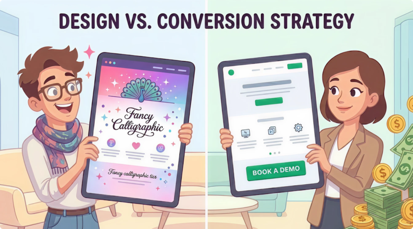
Pretty Doesn’t Convert. Clear Does.
Good landing page design isn’t about looking impressive. It’s about removing friction.
A few principles we apply to every build:
One visual hierarchy. The eye should know exactly where to go first, second, and third. If everything is shouting, nothing is being heard. Strong UX design is what makes that happen.
White space is your friend. Cramming the page with content doesn’t make it more persuasive. It makes it harder to read. Give every element room to breathe.
Mobile is the default. More than 60% of paid traffic in Australia comes from mobile. If your page is designed for desktop and “also works on mobile,” you’ve got it backwards. Design mobile first. Always.
Page speed is a conversion lever. Every extra second of load time costs you conversions. We’ve seen pages double their conversion rate after nothing more than a speed fix. If your page takes more than 2.5 seconds to load on a 4G connection, fix that before you touch anything else.
Use real photography where it counts. Stock images of generic professionals in headsets convince nobody. Show your actual team, your actual office, your actual product, your actual clients. Authenticity converts.
The Silent Killers (How Good Pages Quietly Lose Conversions)
A few common mistakes that show up on almost every underperforming page we audit:
- A nav menu at the top. Take it off. Every link is an exit.
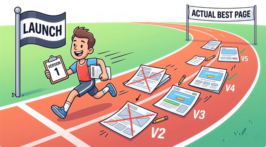
Launch Day Isn’t the Finish Line. It’s the Starting Line.
Even a well-built landing page is just a starting point. The version you launch is rarely the version that converts best six months later.
Get your fundamentals right. Then test.
Test headlines. Test CTAs. Test form length. Test the hero image. Test the order of sections. Make one change at a time, give it enough traffic to draw real conclusions, and let the data tell you what works.
Most of our best-performing client pages went through five or six rounds of iteration. The first version converted. The fifth version converted twice as well.
That’s CRO done properly. And it’s the kind of compounding gain that turns a decent campaign into an outstanding one.
So, Where Does That Leave You?
A landing page isn’t a smaller version of your website. It’s a completely different tool, built for a completely different job.
Get the structure right – one audience, one message, one CTA, a flow that builds trust, and a design that removes friction, and your ad spend starts working a lot harder.
Get it wrong, and you’ll keep wondering why the leads aren’t coming.
If you’re spending good money on Google Ads, Meta, or LinkedIn and the conversions aren’t landing the way they should, the page is usually the problem. Not the ads.
That’s the bit most agencies don’t want to tell you.
Want us to take a look at your landing pages? We’ve built and optimised hundreds of them for Sydney businesses across every industry. No fluff, no jargon – just an honest read on what’s working, what isn’t, and what to do about it. Get in touch for a free landing page audit.