
From Brochure to Blueprint: A Conversion-Focused Website Rebuild for Tacca Industries
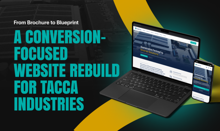
Tacca Industries extrudes its own plastic sheet, thermoforms it in-house, and runs a solar-powered factory 24/7 out of Moorebank. It’s the kind of operation that needs a conversion-focused website to match, and the old site wasn’t built that way.
Family-run since 1987, Tacca manufactures thermoformed food packaging for food, retail and healthcare customers, and recently opened a second manufacturing hub in the Philippines. That kind of scale needs a website that matches it.
The old site was six pages, one paragraph of copy, and a single “Tell Me More” button. Thermoforming and extrusion, the two things Tacca actually sells, had no page of their own. That meant the two services doing the most work for the business had no way to rank in search or make a case to a buyer researching either one.
TL;DR
- Tacca Industries’ six-page brochure site was rebuilt into nine pages, each built around a specific buyer decision.
- Thermoforming and Extrusion, the two things Tacca actually sells, finally have dedicated pages to rank and convert on.
- The Sourcing page’s comparison table does the objection-handling work a salesperson would normally do on a call.
- A persistent header CTA and a conversion band on every page turn browsing into next steps.
- Conversion-focused design isn’t decoration. It’s the structure a site is built around from the first wireframe.
A Falcon Watermark, Not a Factory
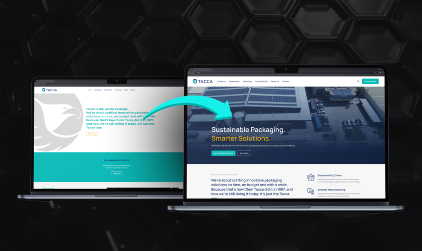
There’s a version of a manufacturer’s website that looks functional on the surface: a logo, a paragraph, a button, nothing obviously broken. The problem only shows up once a buyer tries to find out what the business actually does, and realises the site can’t tell them.
The homepage carried a large grey falcon-logo watermark and little else. There was no product imagery, no proof, and no sense of scale. A visitor had no way to judge whether Tacca was a two-person operation or a 24/7 manufacturing plant. An “Our approach to Covid-19” banner was still live years after it stopped being relevant.
What the Old Site Was Missing
There was no page for thermoforming or extrusion, the two things Tacca actually sells. Without a dedicated page for either capability, neither could rank for the searches a buyer would actually use. Neither had anywhere to make the case for choosing Tacca over a competitor.
There was also no way to tell the sustainability story, now the number one buying criterion in food packaging. There was no community or brand story either, and no page for the new Philippines operation. Three of the things that would most reassure a cautious buyer were simply absent from the site.
The Fix: Structure Before Style
The instinct with a tired website is usually to start with a new look. That wasn’t the answer here. A fresh coat of paint over the same six pages would have left the same gaps. The redesign started with research instead: how buyers in food manufacturing and retail actually evaluate a packaging supplier, and where the local category was falling short online.
The finding was simple: locally, packaging manufacturer websites are functional but flat. Nobody in the Australian category was making a real case for scale or credibility online. That left the door open for whoever moved first.
CCM looked overseas instead of settling for the local benchmark, studying thermoforming manufacturers in the US and Europe, where the digital standard is well ahead of Australia’s. Tacca had the operation to match a global manufacturer; it just needed a site built to the same standard. The two were no longer working against each other.
Nine Pages Built for Conversion-Focused Web Design
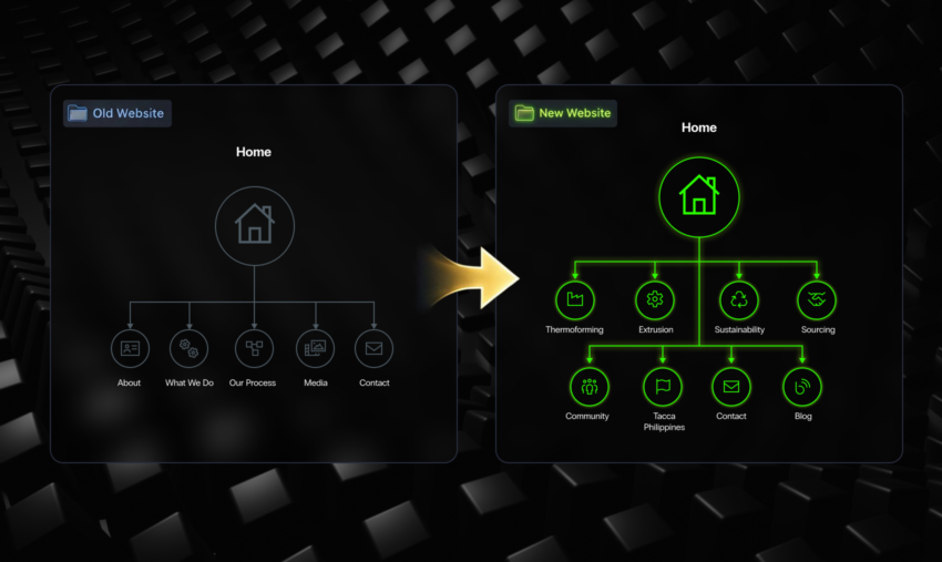
The information architecture was rebuilt around what Tacca sells and what a buyer needs to believe before they enquire, not around internal departments. This meant building individual pages for Thermoforming, Extrusion, Sustainability, Sourcing, Community, and a new Tacca Philippines page.
That distinction matters more than it sounds. A site built around departments asks a buyer to translate ‘who makes this’ into ‘what I actually need to know’ themselves. Most won’t bother. Mapping pages to buyer decisions removes that step: a buyer researching food-grade packaging lands on a page built to answer exactly that question, not a page built to describe a department.
Six pages became nine, and each one now earns its place:
| Page | What it does |
|---|---|
| Home | Sets the tone with proof of scale up front: hero, three pillars, a stat band, a teaser into the process |
| Thermoforming | The core service page: speed, scale, material versatility, and the full process from CAD to mould design |
| Extrusion | Tells the vertical-integration story, control from pellet to finished product |
| Sustainability | Circular economy diagram, the Thermapet recycled-PET innovation, APCO signatory status |
| Sourcing | A service line the old site never mentioned: supply chain sourcing, warehousing, distribution |
| Community | The founder’s legacy, turned into brand equity |
| Tacca Philippines | The dual-hub manufacturing story, built to reassure international buyers |
| News | A filterable hub for community, extrusion and thermoforming updates |
| Contact | Enquiry form, full contact details, and a map |
That’s conversion-focused web design in practice. The Sourcing page below is the clearest example.
The Sourcing Page Does a Salesperson’s Job
Before the rebuild, sourcing wasn’t a service Tacca marketed at all, even though the team was already handling supply chain sourcing, warehousing and distribution for clients who asked. Without a page built around it, a buyer comparing suppliers online had no way to find it. That meant Tacca was quietly leaving a service, and the enquiries attached to it, off the table.
The comparison table on that page walks a buyer through the friction points that usually come up when evaluating a new packaging partner, reliability, communication, lead times, and answers each one before a conversation ever starts. That’s the objection-handling work a salesperson would normally do on a call, done automatically, for every visitor, at any hour. That matters most for the buyers who land on the site outside business hours and would otherwise wait a day for an answer.
A Founder’s Legacy, Built Into the Site
The Community page carries the part of Tacca’s story that never fit on a six-page brochure site. Clem Tacca founded the business in 1987 on the promise of packaging delivered on time, on budget, and with a smile, a phrase the company still uses to describe how it operates.
The page also carries the Clem Tacca Cup, an annual charity golf day established in his memory, alongside a corporate partnership with Pankind Australia. It’s the kind of story a business only earns the right to tell once its website has room for more than a logo and a button.
The header now carries a phone number, search, and a persistent “Get in Touch” CTA. Every page closes on a conversion band. None of that is decorative: it means a visitor is never more than a scroll away from a next step, whichever page they landed on first.
Built to Be Owned, Not Just Delivered
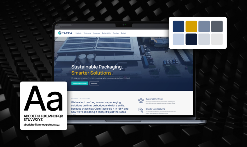
The front end runs on a custom WordPress theme, lightweight and modular, built from 10 layouts of flexible content blocks, so Tacca’s team can update the site without raising a dev ticket.
- Mobile-first, responsive development with semantic markup
- Accessibility and WCAG compliance built in from the layout stage
- Performance optimisation: image handling, lazy loading, front-end caching
Visitors rarely notice these issues consciously, which is exactly why they matter. If a site loads slowly on a phone or doesn’t work properly with a screen reader, someone may leave before reaching the enquiry form. Neither Tacca nor CCM would know what went wrong.
Tested Before It Ever Went Live
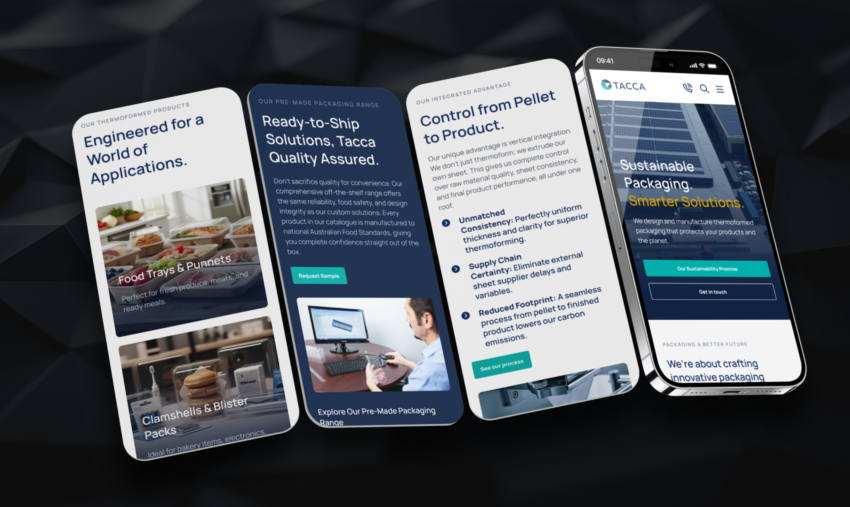
The build went through cross-browser and cross-device testing, a staged UAT process on a live preview link, and DNS, SSL and caching configured with Tacca’s hosting provider, backed by 30 to 60 days of post-launch bug support.
Every image is real: the extrusion line, the factory floor, staff in hi-vis, the solar array on the roof. A buyer is looking at Tacca’s actual operation rather than stock photography standing in for it. A stat band puts hard numbers next to that proof: 550 million packs a year, 80% average recycled content, 100% recyclable by default.
The Results
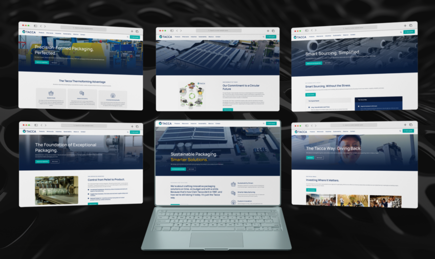
The site launched at tacca.com.au with nine pages built where six used to be. Thermoforming and Extrusion now have dedicated pages to rank and convert on. Tacca’s sales team has a page for each capability to send prospects to, instead of a single generic homepage.
That restructure also delivered on what Tacca had flagged as the priority going in: an entire page for the sustainability story, with a circular economy diagram, the Thermapet recycled-PET innovation, and APCO signatory status, front and centre rather than absent.
The most understated result sits behind the scenes: Tacca’s own team can now update content through flexible blocks without raising a dev ticket every time a page needs a change, a capability outcome as much as a design one. It will keep paying off long after the initial build.ge appearing organically beneath an AI Overview box and a page actively cited as a source inside it. The data above reflects citation, not just position.
The Standout: A Client Asking Us Back
Bill Manser, on behalf of himself and Domenic, put it plainly after launch: “The site looks very professional, and I feel it reinforces our position as a leading player in the Australian Thermoforming industry.”
The second line matters just as much: “Your patience, advice and customer service skills have been immense throughout the project.” That’s not a comment about the finished site. It’s a comment about the process.
Bill’s follow-up said more than the testimonial itself: an invitation to visit Tacca’s facility, and an open door to talk about further advertising and social media work. That’s the kind of track record that starts as one project and keeps going.
The Takeaway
Tacca’s website didn’t need a fresh coat of paint. It needed structure, built around what a buyer needs to believe before they enquire.
This pattern repeats across well-built commercial websites. A site rewards buyers with structure. Dedicated pages compound into stronger rankings. Clear proof points compound into fewer hesitant enquiries. A persistent CTA compounds into more visitors taking the next step.
None of this shows up overnight, and none of it holds without upkeep. But applied consistently, the cumulative effect shows up clearly in how a business presents itself online, as it did for Tacca Industries.
The structural decisions (mapping pages to buyer decisions, building in proof, keeping a conversion path visible) aren’t advanced tactics. They’re the fundamentals of conversion-focused web design. Applied across nine pages, they turned a six-page brochure site into Tacca’s hardest-working sales asset.
Frequently Asked Questions
What does conversion-focused web design actually mean?
It means a site is structured around the decisions a buyer needs to make before they enquire, rather than around internal departments or a generic template. Every page earns its place instead of existing just to look complete.
How long does a website rebuild like this take?
A project of this scale, wireframes through to launch across nine templates, typically runs several months, with time built in for revisions, QA and staged UAT. The brief for Tacca specifically included three rounds of revisions on initial concepts before development began.
Can our own team manage the website after launch?
A site built on flexible content blocks, like Tacca’s custom WordPress build, is designed so a client’s internal team can update pages themselves. That removes the dev-ticket bottleneck that slows most businesses down after launch.
What’s the difference between a brochure site and a conversion-focused site?
A brochure site describes a business. A conversion-focused site is structured to move a visitor toward a decision, with dedicated pages, proof points, and a clear next step on every screen.
More Enquiries From a Site Built to Convert
CCM’s Sydney-based team builds conversion-focused web design around what your buyers need to see before they enquire, not just what looks good on a homepage. That track record goes back to 2008, backed by Google Premier Partner status and no lock-in contracts. Reach out to our team, and we’ll walk you through what that could look like for your business.